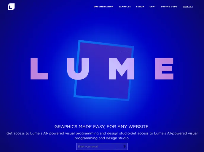
Lume
GPU-powered 3D HTML. <lume-box size="1 2 3">
Overview
LUME is an innovative toolkit designed for developers who want to create rich and interactive 2D or 3D experiences effortlessly. Its modular architecture allows users to work with separate packages or utilize the complete toolkit for more comprehensive projects. With a focus on simplicity and performance, LUME harnesses the power of modern web technologies, making it a valuable asset for web development enthusiasts.
The flexibility of LUME is demonstrated through its various components, which cater to different development needs. Whether you are building an elaborate game or a sleek interactive application, LUME's well-thought-out features ensure that developers can bring their creative ideas to life without unnecessary complexity.
Features
-
Modular Structure: LUME consists of multiple packages that can be used individually or together, allowing for tailored development suited to your project's needs.
-
Rich HTML Elements: Easily define interactive 2D or 3D applications using HTML elements powered by CSS3D and WebGL for advanced graphics and animations.
-
Custom Web Components: The @lume/element package enables you to create fast and efficient web components, enhancing your applications with new, reusable HTML elements.
-
Behavior Extensions: Use element-behaviors to augment HTML elements with additional functionalities, allowing for limitless custom behaviors tailored to your application.
-
WebGL Performance: The glas package provides a WebGL engine built in AssemblyScript, ensuring smooth and consistent performance through the benefits of WebAssembly.
-
Sample Applications: LUMECraft offers a variety of examples built with LUME, showcasing its capabilities and providing forkable starting points for your own projects.
-
Community Engagement: LUME encourages contributions, whether through submitting fixes and new features or participating in discussions via its forums and Discord chat server.
- HTML
HTML templates are pre-designed and pre-built web pages that can be customized and used as a basis for building websites. They often include common elements such as headers, footers, menus, and content sections, and can be easily edited using HTML and CSS to fit specific branding and content needs.
- UI Kits & Components

A UI kit provides developers with a set of reusable components that can be easily integrated into a website or application. These components are pre-designed with consistent styling and functionality, allowing developers to save time and effort in the design and development process. UI kits can be either custom-built or third-party, and often include components for buttons, forms, typography, icons, and more.
- Typescript

TypeScript is a superset of JavaScript, providing optional static typing, classes, interfaces, and other features that help developers write more maintainable and scalable code. TypeScript's static typing system can catch errors at compile-time, making it easier to build and maintain large applications.
- Web Components

Web components provide a way to create reusable, encapsulated UI components using standard web technologies such as HTML, CSS, and JavaScript. They allow developers to create complex UI components that can be easily shared across multiple projects and frameworks. Web components are built using four main specifications: Custom Elements, Shadow DOM, HTML Templates, and ES Modules.