Hynix
Ship faster with production-ready UI components. React + Tailwind CSS + Ark UI.
Overview
Discover a refined collection of UI components that seamlessly combine accessibility, speed, and aesthetic appeal. Built with React, Tailwind CSS, and Ark UI, this library ensures a flawless user experience that developers can rely on. It addresses the growing need for high-quality components that not only look great but also function effectively in diverse applications.
This UI component library prioritizes accessibility and provides a robust developer experience through strong typing. The combination of advanced technologies like React 19 and Tailwind CSS 4 enables developers to create modern applications effortlessly while maintaining a consistent design.
Features
- Accessible - Built on top of Ark UI with full ARIA support, ensuring that users with disabilities can effectively interact with all components.
- Type-safe - TypeScript is implemented throughout the entire project to enhance code quality and reduce runtime errors.
- Modern - Utilizes up-to-date versions of React 19 and Tailwind CSS 4 for a contemporary and flexible design framework.
- Themeable - Includes native support for light and dark modes, allowing developers to adapt the UI based on user preferences.
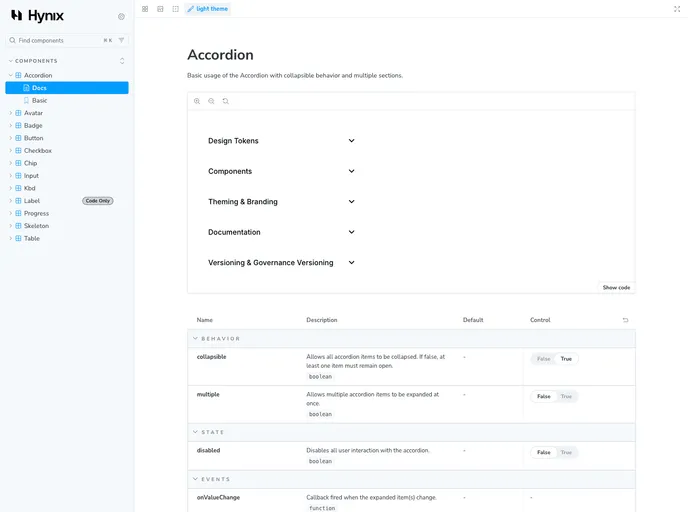
- Documented - Comprehensive documentation for all components is available in Storybook, easing the learning curve for developers.
- License - Released under the MIT License, permitting wide usage and modification in various projects.
- React
React is a widely used JavaScript library for building user interfaces and single-page applications. It follows a component-based architecture and uses a virtual DOM to efficiently update and render UI components
- Vite
Vite is a build tool that aims to provide a faster and leaner development experience for modern web projects
- Tailwind
Tailwind CSS is a utility-first CSS framework that provides pre-defined classes for building responsive and customizable user interfaces.
- Ark UI
Ark UI is a headless component library from the Chakra team that provides unstyled, accessible UI primitives for building design systems. It works across React, Vue, and Solid, offering a framework-agnostic foundation for creating custom component libraries with full accessibility support.
- Storybook
Storybook is a tool for developing and testing UI components in isolation. It provides a sandbox environment where you can experiment with different props and states to see how your component responds.
- Typescript

TypeScript is a superset of JavaScript, providing optional static typing, classes, interfaces, and other features that help developers write more maintainable and scalable code. TypeScript's static typing system can catch errors at compile-time, making it easier to build and maintain large applications.