React Styled Flexboxgrid
Grid system based on styled-components and flexbox for React
Overview
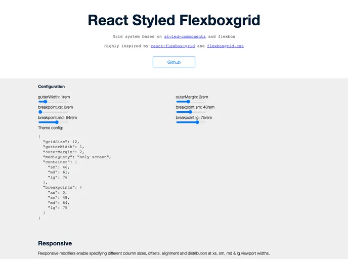
React Styled Flexbox Grid is a powerful and flexible set of React components designed to implement the well-known flexboxgrid.css with the addition of styled-components and emotion. This library streamlines the process of creating responsive grid layouts while maintaining a degree of customizability for various grid configurations, such as gutter widths. It's an excellent option for developers looking to take advantage of modern CSS techniques in a React environment, especially those who are familiar with the classic react-flexbox-grid API.
The library not only enhances the way components are styled but also delivers a seamless experience while building layouts. With its straightforward usage and alignment of properties, React Styled Flexbox Grid can easily integrate into existing projects, making it a go-to solution for responsive design.
Features
-
Customizable Grid Configuration: Easily modify properties like gutter width using the
<ThemeProvider>component from styled-components, ensuring that your grid meets specific design requirements. -
Fluid and Fixed Containers: The
<Grid>component can be set to create either a responsive fixed-width container or a full-width container that spans the entire viewport, providing versatility in layout design. -
Flex Direction Control: Control the layout direction of rows and columns using props like
reverse, allowing for complex arrangements like row-reverse or column-reverse. -
Responsive Breakpoints: Customize visibility and size of columns based on breakpoints (xs, sm, md, lg), giving you full control over your layout's presentation on different devices.
-
Alignment Options: Flexibly align items within the grid using simple string props (start, center, end, top, middle, bottom) to achieve the desired positioning across your rows and columns.
-
Peer Dependencies: Built on top of widely used libraries, it requires minimal setup with react, prop-types, and styled-components, ensuring compatibility and easy integration into your project.
-
Integration with Emotion: For those using Emotion for styling, simply import from
react-styled-flexboxgrid/emotionto leverage the benefits of both libraries seamlessly. -
Open Source: Licensed under MIT, it offers freedom and flexibility for developers to use, modify, and distribute as needed within their projects.
- React
React is a widely used JavaScript library for building user interfaces and single-page applications. It follows a component-based architecture and uses a virtual DOM to efficiently update and render UI components
- Styled Components
Styled Components is a popular library for styling React components using CSS syntax. It allows you to write CSS in your JavaScript code, making it easier to create dynamic styles that are specific to each component.
- Eslint

ESLint is a linter for JavaScript that analyzes code to detect and report on potential problems and errors, as well as enforce consistent code style and best practices, helping developers to write cleaner, more maintainable code.
- Rollup

RollupJS is a popular and efficient JavaScript module bundler that takes the code from multiple modules and packages them into a single optimized file, minimizing the overall size of the application and improving its performance.
- Typescript

TypeScript is a superset of JavaScript, providing optional static typing, classes, interfaces, and other features that help developers write more maintainable and scalable code. TypeScript's static typing system can catch errors at compile-time, making it easier to build and maintain large applications.
- Webpack

Webpack is a popular open-source module bundler for JavaScript applications that bundles and optimizes the code and its dependencies for production-ready deployment. It can also be used to transform other types of assets such as CSS, images, and fonts.