Klee
A personnal UI library made as an excuse to have a published UI package
Overview
Klee UI™ is a library UI created to test the workflow of building a packaged UI kit. It is built with styled-system, emotion, framer-motion, and TypeScript. While not as extensive as Chakra-UI, it can still be used for livestreams and other purposes. Klee UI™ supports dark mode and offers a great developer experience with autocomplete and suggestions for color props, border radiuses, and z indices.
Features
- Styled-system integration: All UI components extend the base Box component, allowing for the use of styled system props and responsive styles.
- Theme customization: The theme file contains all the values for typography, colors, spacing, and more. The color palette used is from Tailwind 2.0.
- Great developer experience: Klee UI™ leverages TypeScript and provides typings for autocomplete and suggestions. Enums for color props, border radiuses, z indices, etc., are also available.
Summary
Klee UI™ is a library UI that offers a streamlined development workflow for building a packaged UI kit. It integrates styled-system, emotion, framer-motion, and TypeScript to provide a great developer experience. With its support for dark mode and customizable themes, Klee UI™ is a versatile choice for UI development. However, it is worth noting that it is still in the early stages of development and may not be fully functional.
- React
React is a widely used JavaScript library for building user interfaces and single-page applications. It follows a component-based architecture and uses a virtual DOM to efficiently update and render UI components
- UI Kits & Components

A UI kit provides developers with a set of reusable components that can be easily integrated into a website or application. These components are pre-designed with consistent styling and functionality, allowing developers to save time and effort in the design and development process. UI kits can be either custom-built or third-party, and often include components for buttons, forms, typography, icons, and more.
- Eslint

ESLint is a linter for JavaScript that analyzes code to detect and report on potential problems and errors, as well as enforce consistent code style and best practices, helping developers to write cleaner, more maintainable code.
- Framer Motion

Alpine.js is a lightweight JavaScript framework that simplifies the process of creating dynamic, reactive user interfaces on the web. It uses a declarative syntax that offers a higher level of abstraction compared to vanilla JavaScript, while being more performant and easier to use than jQuery.
- React Hook Form

React Hook Form is a performant, flexible, and extensible form library for React with easy validation. It reduces re-renders and improves performance by using uncontrolled components and native HTML validation, making form handling simple and efficient.
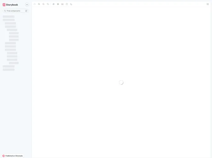
- Storybook
Storybook is a tool for developing and testing UI components in isolation. It provides a sandbox environment where you can experiment with different props and states to see how your component responds.
- Typescript

TypeScript is a superset of JavaScript, providing optional static typing, classes, interfaces, and other features that help developers write more maintainable and scalable code. TypeScript's static typing system can catch errors at compile-time, making it easier to build and maintain large applications.
- Webpack

Webpack is a popular open-source module bundler for JavaScript applications that bundles and optimizes the code and its dependencies for production-ready deployment. It can also be used to transform other types of assets such as CSS, images, and fonts.
- Zod

Zod is a TypeScript-first schema declaration and validation library. It allows you to define schemas that can validate data at runtime while providing excellent TypeScript inference, making it perfect for API validation, form validation, and type-safe data handling.