Spark Web
Simple, Modular & Accessible UI Components for your React Applications
Overview
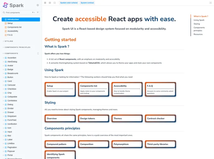
Adevinta's React Design System, known as SPARK-UI, offers a robust framework for crafting accessible and user-friendly interfaces. This design system prioritizes both functionality and aesthetic appeal, making it a great resource for developers aiming to enhance their web applications. With an emphasis on community and contribution, SPARK-UI is built to evolve and adapt to the needs of its users.
The structure of SPARK-UI ensures that best practices for accessibility are at the forefront of its development. By providing clear guidelines and a Code of Conduct, Adevinta fosters a collaborative environment where developers can contribute and grow together. The focus on support across various browsers further ensures that applications built upon this design system reach the widest audience possible.
Features
- Accessibility Focus: SPARK-UI emphasizes accessibility, ensuring that applications remain usable for all individuals.
- Contribution Guidelines: An established contributing guide makes it easy for new developers to get involved and share their input.
- Code of Conduct: A set of expectations for behavior creates a respectful and productive community for all participants.
- Browser Compatibility: The design system outlines browser support details clearly, ensuring consistent user experiences across different platforms.
- Open Source License (MIT): SPARK-UI is available under the MIT license, allowing for broad usage and modification by developers.
- Active Community: A strong community of contributors and maintainers supports continuous improvement and innovation within the design system.
- React
React is a widely used JavaScript library for building user interfaces and single-page applications. It follows a component-based architecture and uses a virtual DOM to efficiently update and render UI components
- Vite
Vite is a build tool that aims to provide a faster and leaner development experience for modern web projects
- Tailwind
Tailwind CSS is a utility-first CSS framework that provides pre-defined classes for building responsive and customizable user interfaces.
- UI Kits & Components

A UI kit provides developers with a set of reusable components that can be easily integrated into a website or application. These components are pre-designed with consistent styling and functionality, allowing developers to save time and effort in the design and development process. UI kits can be either custom-built or third-party, and often include components for buttons, forms, typography, icons, and more.
- Eslint

ESLint is a linter for JavaScript that analyzes code to detect and report on potential problems and errors, as well as enforce consistent code style and best practices, helping developers to write cleaner, more maintainable code.
- Postcss

PostCSS is a popular open-source tool that enables web developers to transform CSS styles with JavaScript plugins. It allows for efficient processing of CSS styles, from applying vendor prefixes to improving browser compatibility, ultimately resulting in cleaner, faster, and more maintainable code.
- Rollup

RollupJS is a popular and efficient JavaScript module bundler that takes the code from multiple modules and packages them into a single optimized file, minimizing the overall size of the application and improving its performance.
- Storybook
Storybook is a tool for developing and testing UI components in isolation. It provides a sandbox environment where you can experiment with different props and states to see how your component responds.
- Typescript

TypeScript is a superset of JavaScript, providing optional static typing, classes, interfaces, and other features that help developers write more maintainable and scalable code. TypeScript's static typing system can catch errors at compile-time, making it easier to build and maintain large applications.