Lumen Blocks
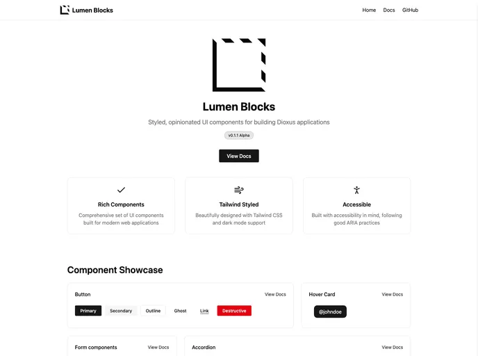
an ARIA-accessible, styled, opinionated component library for Dioxus inspired by the shadcn UI project, and built on top of the Dioxus Primitives unstyled components library.
Overview
Lumen is an innovative ARIA-accessible component library designed specifically for Dioxus, drawing inspiration from the popular shadcn UI project. It combines a visually appealing style with a structured approach, built on top of the unstyled components from Dioxus Primitives. Although currently in an experimental phase, Lumen has the potential to greatly enhance the development experience for those using Dioxus.
Being an evolving project, Lumen is not without its quirks. Users can expect bugs and some breaking changes until the library reaches a stable release. For those willing to explore and contribute, Lumen promises a rich set of components that can help elevate web applications while maintaining accessibility standards.
Features
-
ARIA Accessibility: Designed with accessibility in mind, Lumen ensures that components can be used by individuals with disabilities, following ARIA standards.
-
Styled Components: Lumen offers a range of well-styled components that help developers create visually appealing applications without starting from scratch.
-
Based on Dioxus Primitives: Built on Dioxus Primitives, it utilizes a robust base of unstyled components, making it easy to customize and extend.
-
Inspired by shadcn UI: The design philosophy behind Lumen is influenced by the established shadcn UI project, ensuring a modern feel.
-
Open-Source Collaboration: Acknowledging its roots, Lumen encourages developer participation and contributions, enhancing its functions and features over time.
-
MIT License: Lumen's source code is open under the MIT license, promoting collaboration and innovation within the developer community.
-
Experimental Nature: As an experimental library, Lumen provides opportunities for developers to influence its development by discovering potential issues and proposing improvements.
- UI Kits & Components

A UI kit provides developers with a set of reusable components that can be easily integrated into a website or application. These components are pre-designed with consistent styling and functionality, allowing developers to save time and effort in the design and development process. UI kits can be either custom-built or third-party, and often include components for buttons, forms, typography, icons, and more.