Kubit React Components
Kubit React Components is a customizable, accessible library of React web components, designed to enhance your application's user experience.
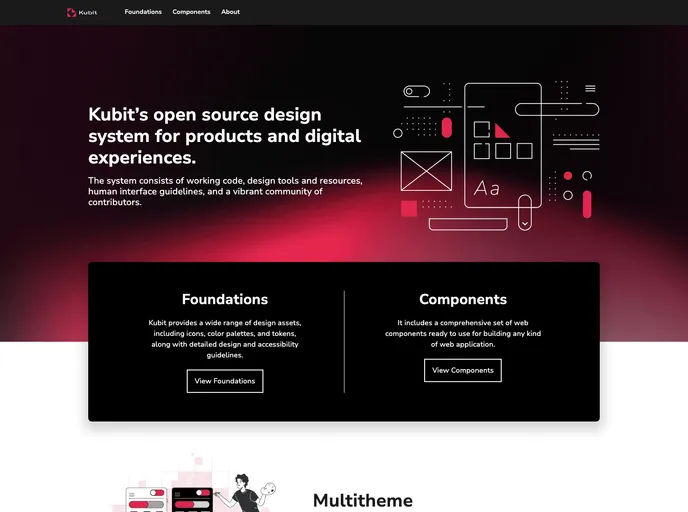
Overview
The Kubit UI package offers a modern approach for developers looking to enhance their applications with visually appealing and functional components. The installation process is straightforward, allowing you to quickly implement the package's features. With a focus on simplicity and ease of use, Kubit UI aims to provide a robust set of web components, making it an attractive option for both beginner and experienced developers.
Features
- Easy Installation: Simply run
npmoryarnto install the package along with all its dependencies, getting you started in no time. - Component Usage: Import components seamlessly into your application to leverage default styles and functionality, enhancing the user experience with minimal effort.
- KubitProvider Dependency: Required for utilizing components, it establishes the necessary theme and context, ensuring consistency across your application.
- Comprehensive Documentation: Access detailed documentation on the Kubit UI website, helping you navigate and utilize the components effectively.
- Storybook Integration: Clone the repository and run the storybook to view components in action, enabling quick testing and previewing of UI elements.
- Testing Capabilities: Easily run tests with a simple command to verify the functionality of components and ensure a reliable user experience.
- Contribution Guidelines: Engage with the project by following clear steps for contributing, making it easy to get involved and improve the package.
- Automatic Version Control: Enjoy an advanced publishing system that automatically manages version bumps based on branch naming patterns, streamlining your development workflow.
- React
React is a widely used JavaScript library for building user interfaces and single-page applications. It follows a component-based architecture and uses a virtual DOM to efficiently update and render UI components
- Vite
Vite is a build tool that aims to provide a faster and leaner development experience for modern web projects
- Styled Components
Styled Components is a popular library for styling React components using CSS syntax. It allows you to write CSS in your JavaScript code, making it easier to create dynamic styles that are specific to each component.
- Eslint

ESLint is a linter for JavaScript that analyzes code to detect and report on potential problems and errors, as well as enforce consistent code style and best practices, helping developers to write cleaner, more maintainable code.
- Storybook
Storybook is a tool for developing and testing UI components in isolation. It provides a sandbox environment where you can experiment with different props and states to see how your component responds.
- Typescript

TypeScript is a superset of JavaScript, providing optional static typing, classes, interfaces, and other features that help developers write more maintainable and scalable code. TypeScript's static typing system can catch errors at compile-time, making it easier to build and maintain large applications.
- Web Components

Web components provide a way to create reusable, encapsulated UI components using standard web technologies such as HTML, CSS, and JavaScript. They allow developers to create complex UI components that can be easily shared across multiple projects and frameworks. Web components are built using four main specifications: Custom Elements, Shadow DOM, HTML Templates, and ES Modules.