Orbit
React components of open-source Orbit design system by Kiwi.com
Overview
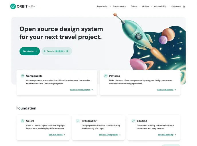
Orbit is an impressive open-source design system developed by Kiwi.com that provides a comprehensive collection of React components aimed at streamlining the development of user interfaces. With its clean and efficient design, Orbit not only enhances the aesthetic appeal of applications but also boosts usability through its thoughtfully crafted components. Designed for flexibility and compatibility, it caters to developers looking to implement sophisticated design elements with ease.
The components within the Orbit design system are built to be easily customizable, allowing teams to maintain consistency in their projects while also adapting to unique brand requirements. This makes Orbit a valuable resource for both individual developers and large teams looking to speed up their development processes without compromising on quality or design integrity.
Features
- Comprehensive Component Library: Orbit offers a wide array of pre-built components that cover various aspects of UI design, from buttons to modals and everything in between.
- Customizable Styles: Each component can be easily tailored to suit your brand or project needs, ensuring a cohesive aesthetic throughout your application.
- Responsive Design: All components are designed to be responsive, ensuring they look great on any device, whether it’s a mobile phone or a desktop.
- Accessibility Focused: Orbit emphasizes accessibility in its components, making it easier for developers to create applications that everyone can use.
- Consistent Design Language: By using Orbit, developers can maintain a consistent design language across different parts of their application, promoting a seamless user experience.
- Active Community Support: Being an open-source project, Orbit benefits from contributions and support from a vibrant community of developers who share best practices and improvements.
- Easy Integration: The components are built specifically for React, ensuring a smooth and intuitive integration process into existing React applications.
- React
React is a widely used JavaScript library for building user interfaces and single-page applications. It follows a component-based architecture and uses a virtual DOM to efficiently update and render UI components
- Styled Components
Styled Components is a popular library for styling React components using CSS syntax. It allows you to write CSS in your JavaScript code, making it easier to create dynamic styles that are specific to each component.
- UI Kits & Components

A UI kit provides developers with a set of reusable components that can be easily integrated into a website or application. These components are pre-designed with consistent styling and functionality, allowing developers to save time and effort in the design and development process. UI kits can be either custom-built or third-party, and often include components for buttons, forms, typography, icons, and more.