More Shadcn Svelte
Collection of new shadcn-svelte components
Overview
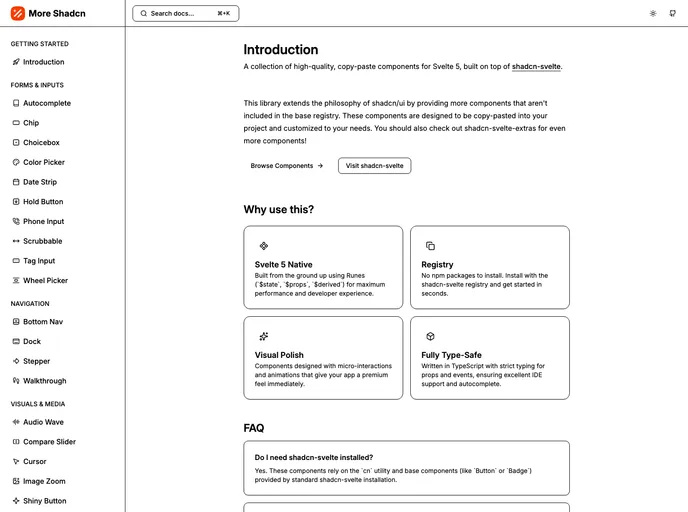
More-shadcn-svelte is a versatile library that provides high-quality, reusable components specifically designed for use with Svelte 5. Building upon the foundational philosophy of shadcn/ui, this collection introduces a broader range of components that enhance functionality and aesthetic appeal. Each component in this library is crafted to be easily integrated into your existing projects, offering developers a simple way to enhance their applications with minimal effort.
With an emphasis on customization, more-shadcn-svelte empowers developers to adapt components to their specific needs. This flexibility ensures that whether you're building a small personal project or a larger application, you can seamlessly incorporate these components without compromising on design or performance.
Features
- High-Quality Components: Each component is built with attention to detail, ensuring a polished look and feel that can elevate any Svelte application.
- Copy-Paste Ready: The components are designed to be easily copied and pasted into your projects, allowing for quick implementation without the hassle of extensive setup.
- Customizable: Tailor each component to fit your specific requirements, making it simple to align with your project's design and functionality needs.
- Extended Philosophy: Expanding on the shadcn/ui approach, this library provides additional components that are not available in the base registry, giving users more options and flexibility.
- Optimized for Svelte 5: The components are specifically crafted to work seamlessly with the latest version of Svelte, ensuring compatibility and performance.
- Time-Saving: By providing ready-to-use components, developers can save valuable time during the development process, allowing them to focus on more complex features of their applications.
- User-Friendly Documentation: The library includes clear documentation for each component, making it easier for developers to implement and customize as needed.
- Svelte
Svelte is a modern front-end framework that compiles your code at build time, resulting in smaller and faster applications. It uses a reactive approach to update the DOM, allowing for high performance and a smoother user experience.
- Vite
Vite is a build tool that aims to provide a faster and leaner development experience for modern web projects
- Tailwind
Tailwind CSS is a utility-first CSS framework that provides pre-defined classes for building responsive and customizable user interfaces.
- Bits UI
Bits UI is a headless component library for Svelte that provides unstyled, accessible UI primitives. It powers shadcn-svelte and offers a foundation for building custom component libraries with full accessibility support in the Svelte ecosystem.
- Shadcn UI
Beautifully designed components that you can copy and paste into your apps. Accessible. Customizable. Open Source.
- UI Kits & Components

A UI kit provides developers with a set of reusable components that can be easily integrated into a website or application. These components are pre-designed with consistent styling and functionality, allowing developers to save time and effort in the design and development process. UI kits can be either custom-built or third-party, and often include components for buttons, forms, typography, icons, and more.
- Typescript

TypeScript is a superset of JavaScript, providing optional static typing, classes, interfaces, and other features that help developers write more maintainable and scalable code. TypeScript's static typing system can catch errors at compile-time, making it easier to build and maintain large applications.