Bootstrap4 Fs Modal
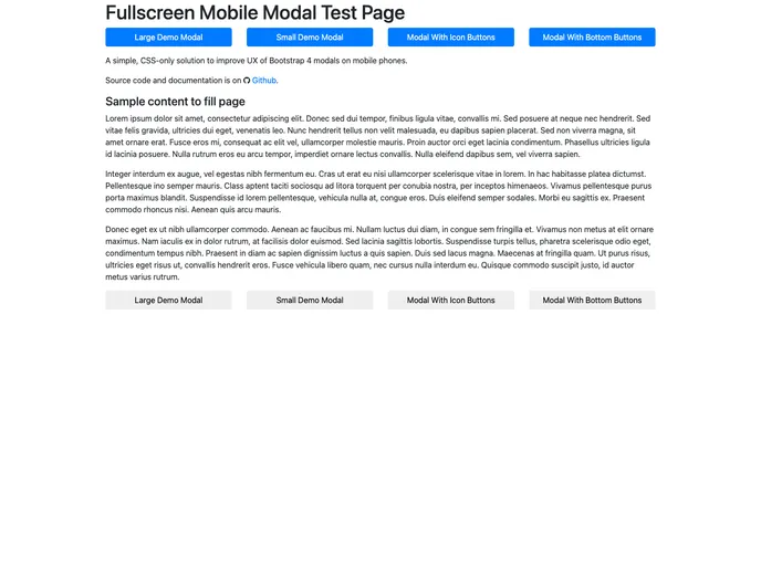
A simple way to improve UX of Bootstrap 4 modals on mobile phones.
Overview
The Bootstrap Mobile FullScreen Modal is an innovative solution designed to enhance the user experience for Bootstrap 4 modals on mobile devices. Regular Bootstrap modals can often lead to frustrating vertical scrolling, particularly when they contain a lot of content. This fullscreen modal option provides a much more seamless and native experience for users by adapting the modal's interface for smaller screens. With responsive behavior that rivals that of ZURB Foundation modals, it's an effective way to ensure that content remains easily accessible and manageable on mobile.
By leveraging simple CSS styles, this plugin makes it easy to convert existing Bootstrap modals into a fullscreen format. The design enhancements not only improve usability but also ensure that the layout remains clean and organized, allowing users to focus on the content without unnecessary distractions.
Features
-
CSS-Only Implementation: The plugin works purely with CSS, making it lightweight and easy to integrate into any existing Bootstrap project without additional JavaScript.
-
Responsive Modal Design: Fullscreen modals adjust correctly on mobile devices, reducing the need for vertical scrolling and enhancing the user experience.
-
Max Height for Large Screens: On larger devices, the modal applies a maximum height to prevent excessive scrolling, ensuring footer buttons remain easily accessible.
-
Customizable Modal Classes: Easily apply either the
modal-fullscreenclass for individual modals or thebootstrap-fs-modalclass to a container for batch updates across multiple modals. -
Fixed Bottom Modal Footer: For modals with large text buttons, there's an option to use a fixed footer, improving accessibility and usability on mobile screens.
-
Icon Support: Styles include adjustments for Font Awesome and Google Material icons, ensuring consistent sizing and alignment within modal components.
-
Bootstrap Responsive Classes: Utilize responsive design classes to tailor footer button appearances for smaller screen breakpoints, keeping the interface neat.
-
Compatibility with Existing Bootstrap: Fully compliant with Bootstrap 4 and its components, making it a seamless addition to any Bootstrap-based project.
- Bootstrap
Bootstrap is the most popular CSS Framework for developing responsive and mobile-first websites.
- Grunt

Grunt is a popular JavaScript task runner that automates repetitive tasks like minification, compilation, and testing, allowing developers to focus on writing code.