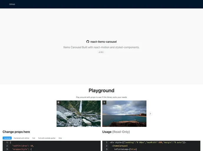
React Items Carousel
Items Carousel Built with react-motion and styled-components
Overview
React Items Carousel is an innovative component that simplifies the process of creating a responsive and visually appealing carousel for displaying items in a variety of applications. With its sleek design and customizable features, developers can easily integrate this carousel into their projects to enhance user experience and interactivity. Whether showcasing products or images, this carousel offers flexibility and function, making it a popular choice among developers.
The component's solid performance and ease of use allow it to handle various content types effectively. Coupled with adjustable parameters, React Items Carousel caters to different design needs, allowing for a seamless browsing experience that keeps users engaged.
Features
- Children: Accepts an array of nodes to render in the carousel, ensuring that the visual element is customizable and can be tailored to specific content.
- Request to Change Active: A function that allows developers to manage the active item state dynamically, enhancing interactivity.
- Active Item Index: This property specifies the currently active item in the carousel, giving precise control over which item is displayed.
- Number of Cards: Allows the specification of how many cards to show per slide, with a default of three, enabling tailored display options.
- Infinite Loop: An option to enable endless sliding through items, adding to user engagement with the content.
- Gutter: Provides the ability to set the space between cards, ensuring that the visual aesthetic meets design requirements.
- Show Slither: When enabled, this feature reveals a portion of the next card, enticing users to explore further.
- First and Last Gutter: This option allows for greater spacing around the first and last cards, improving the layout visually.
- Express
Express.js is a simple Node.js framework for single, multi-page, and hybrid web applications.
- React
React is a widely used JavaScript library for building user interfaces and single-page applications. It follows a component-based architecture and uses a virtual DOM to efficiently update and render UI components
- Styled Components
Styled Components is a popular library for styling React components using CSS syntax. It allows you to write CSS in your JavaScript code, making it easier to create dynamic styles that are specific to each component.
- Ant Design
Ant Design is a React UI library that provides a set of pre-designed components and design resources for building high-quality, responsive web applications.
- Eslint

ESLint is a linter for JavaScript that analyzes code to detect and report on potential problems and errors, as well as enforce consistent code style and best practices, helping developers to write cleaner, more maintainable code.
- GitHub Pages

Gridsome is a Vue.js-based static site generator that makes it easy to build fast and flexible websites and applications by leveraging modern web technologies like GraphQL, Webpack, and hot reloading
- Webpack

Webpack is a popular open-source module bundler for JavaScript applications that bundles and optimizes the code and its dependencies for production-ready deployment. It can also be used to transform other types of assets such as CSS, images, and fonts.