Themeless UI
A React component library harnessing the power of CSS.
Overview:
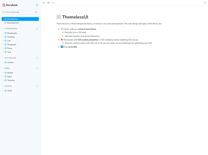
ThemelessUI is a React component library that aims to provide a unique approach to styling. It is currently in the early stages of development but offers a range of features that make it a promising choice for developers. The library focuses on minimalism and themeability, allowing easy customization while ensuring accessibility.
Features:
- Minimal base theme: ThemelessUI comes with a minimal base theme that includes a CSS reset. This allows developers to start with a clean slate for styling their components.
- Themeable with CSS custom properties: The library utilizes CSS custom properties (CSS variables) for theming. This provides flexibility and makes it easy to customize the appearance of components.
- Targeting CSS classes: In addition to CSS custom properties, ThemelessUI allows styling customization by targeting CSS classes. This provides more options for styling and allows developers to use their preferred styling approach.
- Build tool compatibility: Since ThemelessUI uses CSS instead of CSS-in-JS, it can be easily used with any build tools for optimizing CSS. This ensures efficient and optimized styling for the components.
- Fully accessible: The library prioritizes accessibility and ensures that components are accessible by default. However, it does warn against using low contrast text combinations that may affect accessibility.
Summary:
ThemelessUI is a promising React component library that offers a unique approach to styling. With its minimal base theme, themeability with CSS custom properties, and compatibility with build tools, it provides developers with flexibility and ease of customization. The library also prioritizes accessibility, ensuring that components are fully accessible by default. However, it's important to be mindful of text contrast combinations to maintain accessibility standards.