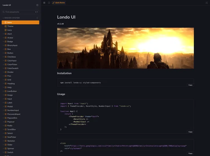
Londo UI
The spectacular view. A component library for React web apps.
Overview
Londo UI is a component library specifically designed for React web apps. It is currently a work in progress with an initial release coming soon. While its primary purpose is to support the Umbasa game engine and other personal web projects, the source code of Londo UI can also be useful for developers who are building their own React components.
Features
- Optimized for Desktop: Londo UI components are designed to be compact and provide a seamless mouse and keyboard interaction experience for desktop users.
- Ease of Styling: The library supports styled-system props, allowing developers to easily apply styles based on structured values defined in the global theme object.
- Flexible and Composable: Londo UI is built on top of primitive layout components such as Box, Flex, and Grid, providing flexibility and composability in building complex UI structures.
- Dark Mode: The components in Londo UI come with a dark color scheme by default, but a light theme is also available for those who prefer a different color scheme.
Summary
Londo UI is a React component library aimed at providing an optimized desktop experience and ease of styling for React web apps. It offers flexibility and composability through its use of primitive layout components and supports both dark and light color schemes. While still a work in progress, Londo UI can be a valuable resource for developers working on their own React components.