Mind_UI
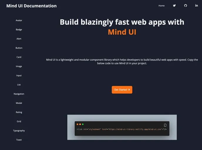
Mind UI is a lightweight and modular component library which helps developers to build blazingly fast web apps.
Overview
Mind UI is an innovative and lightweight component library designed with developers in mind. Its modular approach allows for swift creation of beautiful web applications, making it an ideal choice for those looking to enhance the aesthetic and functional quality of their projects without sacrificing performance. With simple integration steps and support for popular web technologies, Mind UI eases the development process, enabling faster delivery of high-quality web applications.
Whether you are building a complex application or simply need some stylish components for your project, Mind UI provides a solid foundation. Its flexibility ensures that developers can customize elements to fit their specific design needs, promoting creativity while adhering to best practices in web development.
Features
- Lightweight Design: Mind UI is built to be minimalistic, ensuring that your applications remain fast and responsive.
- Modular Components: Flexibility is key; the library's modular structure allows developers to integrate only the components they need.
- Easy Integration: Quick setup with simple HTML or CSS imports makes it easy to incorporate Mind UI into existing or new projects.
- Built with Modern Technologies: Utilizes HTML, CSS, JavaScript, and React.js, ensuring broad compatibility and accessibility.
- Developer-Friendly Documentation: Comprehensive documentation helps developers get started rapidly and effectively utilize the library's features.
- Live Demo Available: Test components in action via a live demo, helping developers visualize their implementation before committing to a project.
- Community Support: The project encourages developers to contribute and share feedback, fostering a collaborative environment for improvement and enhancement.
- React
React is a widely used JavaScript library for building user interfaces and single-page applications. It follows a component-based architecture and uses a virtual DOM to efficiently update and render UI components
- Documentation

Documentation themes are built specifically for writing technical and product documentation. They are normally written and maintained in Markdown. The often include a navigation menu, search bar, clear headings, semantic document structure and clean typography.
- UI Kits & Components

A UI kit provides developers with a set of reusable components that can be easily integrated into a website or application. These components are pre-designed with consistent styling and functionality, allowing developers to save time and effort in the design and development process. UI kits can be either custom-built or third-party, and often include components for buttons, forms, typography, icons, and more.