XtremeUI
XtremeUI: A dynamic React component library leveraging Vite, React, and Scss for rapid UI development. Boost your frontend with customizable, responsive, and accessible components.
Overview
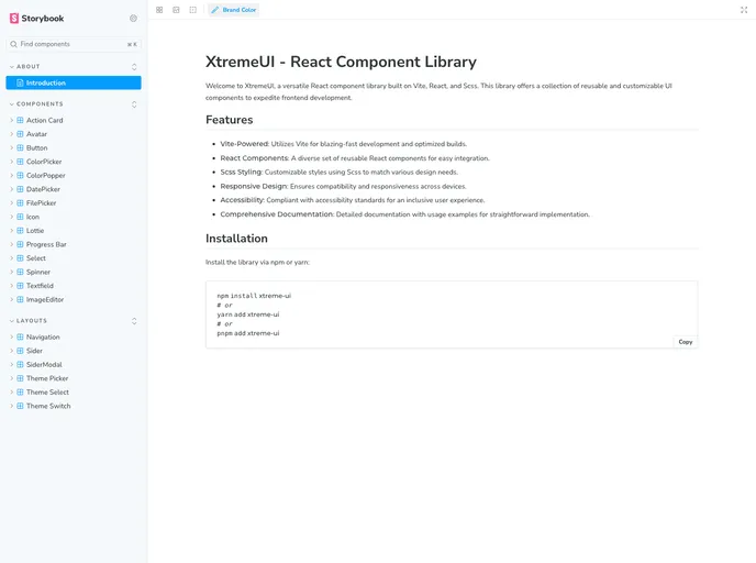
XtremeUI is a versatile React component library built on Vite, React, and Scss. It offers a collection of reusable and customizable UI components that aim to expedite frontend development. With features such as Vite-powered development, a wide range of React components, customizable Scss styling, responsive design, accessibility compliance, and comprehensive documentation, XtremeUI provides developers with a powerful toolkit to create user-friendly and visually appealing interfaces.
Features
- Vite-Powered: Utilizes Vite to provide fast development and optimized builds.
- React Components: A diverse set of reusable React components for easy integration into projects.
- Scss Styling: Customizable styles using Scss, allowing developers to adapt components to match various design needs.
- Responsive Design: Ensures compatibility and responsiveness across different devices, creating a seamless user experience.
- Accessibility: XtremeUI follows accessibility standards to ensure that the components are usable by all users, regardless of their abilities.
- Comprehensive Documentation: Detailed documentation with extensive usage examples to facilitate straightforward implementation of the library.
Summary
XtremeUI is a comprehensive React component library designed to enhance frontend development. With its Vite-powered development process, diverse set of reusable React components, customizable Scss styling, responsive design, accessibility compliance, and comprehensive documentation, XtremeUI offers developers a robust toolkit to create visually appealing and accessible interfaces. Its ease of installation makes it a valuable asset for developers seeking to streamline their frontend development workflow.