Storylite

[Experimental] Lightweight alternative to StoryBook for React, built on top of Vite, compatible with CSF 3.0
Overview
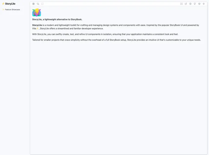
StoryLite is an innovative toolkit that simplifies the creation and management of design systems and React components. Built on the popular Vite framework, it aims to provide developers with an efficient and lightweight alternative to larger systems like StoryBook. With its focus on delivering a streamlined user experience, StoryLite allows developers to craft and test React-based UI components in isolation, ensuring consistent application aesthetics without the complexity of extensive setups.
This toolkit has been designed specifically for smaller React projects, making it an ideal choice for developers looking for a straightforward solution to component management. With features that prioritize customization and simplicity, StoryLite stands out as a practical option for those wanting to enhance project organization while maintaining flexibility.
Features
- Lightweight: At just 36 KB minified, with a minimal gzipped version, StoryLite is especially designed for Single-Page Applications to reduce overhead.
- Mobile-Friendly UI: An interface that adapts seamlessly across devices, enhancing user experience for mobile viewers.
- Full Control: You dictate where the StoryLite app is mounted and how it runs with plain Vite, eliminating reliance on custom servers.
- Fully Customizable: Tailor every aspect of the UI and iframe to suit your project's specific needs, ensuring a unique experience.
- Isolated Canvas: The default iframe comes with no styles, granting you full control over what styles are applied.
- CSF 3.0 Interoperability: Easily adapt your existing StoryBook stories with minimal changes to work with StoryLite, leveraging the Component Story Format.
- Flexible Render Modes: Choose to render stories inside an iframe or in the same DOM tree, which is beneficial for SEO considerations.
- Built-in Addons: Equipped with essential features like dark mode, mobile view, and the ability to maximize the interface for easier interaction.

- React
React is a widely used JavaScript library for building user interfaces and single-page applications. It follows a component-based architecture and uses a virtual DOM to efficiently update and render UI components
- Vite
Vite is a build tool that aims to provide a faster and leaner development experience for modern web projects
- UI Kits & Components

A UI kit provides developers with a set of reusable components that can be easily integrated into a website or application. These components are pre-designed with consistent styling and functionality, allowing developers to save time and effort in the design and development process. UI kits can be either custom-built or third-party, and often include components for buttons, forms, typography, icons, and more.
- Storybook
Storybook is a tool for developing and testing UI components in isolation. It provides a sandbox environment where you can experiment with different props and states to see how your component responds.
- Typescript
TypeScript is a superset of JavaScript, providing optional static typing, classes, interfaces, and other features that help developers write more maintainable and scalable code. TypeScript's static typing system can catch errors at compile-time, making it easier to build and maintain large applications.