Intentui
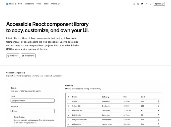
Intent UI is a chill set of React components, built on top of React Aria Components and Tailwind CSS. Easy to customize and just copy & paste into your React projects.
Overview
UIOGIntent UI is an innovative set of React components designed to enhance web accessibility while offering sleek and customizable design options. Built atop the React Aria Components, it presents a user-friendly solution for developers looking to integrate accessible features into their projects effortlessly. The integration of Tailwind CSS ensures that your applications not only function well but also look modern and appealing.
This component library prioritizes ease of use, allowing you to simply copy and paste elements into your React projects. Whether you're a seasoned developer or just starting out, UIOGIntent UI is geared towards making web development faster and more intuitive, enabling you to focus on creativity rather than constraints.
Features
- Accessibility First: Designed with accessibility in mind, ensuring that all users can interact with your web applications seamlessly.
- React Aria Components: Built on robust components that follow best practices, enhancing user experience through proper ARIA roles and attributes.
- Tailwind CSS Integration: Comes with Tailwind CSS out of the box for a clean and modern design approach, saving you time on styling.
- Easy Customization: Tailor components to your specific needs quickly; just copy, paste, and modify as needed.
- Documentation Available: Clear and comprehensive documentation guides you through installation and customization, making onboarding a breeze.
- Community Contribution: Encourages developers to contribute and collaborate, fostering an active community around the component library.
- MIT License: Licensed under the MIT license, allowing for flexibility in usage and modification as long as proper credit is given.
- Fumadocs
Fumadocs is a powerful documentation framework for Next.js that provides MDX support, full-text search, syntax highlighting, and beautiful default styling. It's designed for building fast, SEO-friendly documentation sites.
- Next.js
Next.js is a React-based web framework that enables server-side rendering, static site generation, and other powerful features for building modern web applications.
- React
React is a widely used JavaScript library for building user interfaces and single-page applications. It follows a component-based architecture and uses a virtual DOM to efficiently update and render UI components
- Tailwind
Tailwind CSS is a utility-first CSS framework that provides pre-defined classes for building responsive and customizable user interfaces.
- React Aria
Craft world-class accessible components with custom styles. Over 40 components with built-in behavior, adaptive interactions, top-tier accessibility, and internationalization out of the box, ready for your styles.
- Shadcn UI
Beautifully designed components that you can copy and paste into your apps. Accessible. Customizable. Open Source.
- UI Kits & Components

A UI kit provides developers with a set of reusable components that can be easily integrated into a website or application. These components are pre-designed with consistent styling and functionality, allowing developers to save time and effort in the design and development process. UI kits can be either custom-built or third-party, and often include components for buttons, forms, typography, icons, and more.
- Motion

Motion (formerly Framer Motion) is a production-ready animation library for React and JavaScript. It provides a simple declarative API for creating fluid animations, gestures, and transitions with excellent performance and accessibility.
- Postcss

PostCSS is a popular open-source tool that enables web developers to transform CSS styles with JavaScript plugins. It allows for efficient processing of CSS styles, from applying vendor prefixes to improving browser compatibility, ultimately resulting in cleaner, faster, and more maintainable code.
- Recharts

Recharts is a powerful and easy-to-use React library for building customizable and interactive charts. Built on D3.js, it offers a wide range of pre-built chart types, such as line, bar, pie, and scatter charts, all of which can be composed with a declarative syntax.
- Typescript

TypeScript is a superset of JavaScript, providing optional static typing, classes, interfaces, and other features that help developers write more maintainable and scalable code. TypeScript's static typing system can catch errors at compile-time, making it easier to build and maintain large applications.