Onyxia UI
Onyxia UI toolkit
Overview
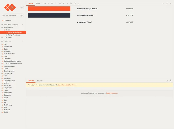
The onyxia-ui is a default design system created by Marc Hufschmitt. It is currently under active development and its APIs are subject to change until version 1. However, it is important to note that onyxia-ui is only compatible with single-page applications (SPAs) and not compatible with server-side rendering (SSR) or static site generation (SSG). The motivation behind creating this toolkit was to provide a better experience for TypeScript developers and address the difficulties in building responsive designs and customizing themes with Material-ui. The onyxia-ui toolkit aims to optimize TypeScript development, make responsive design implementation easier, provide built-in dark mode support, offer guided theme customization, and include a splash screen to hide components during loading.
Features
- Optimized for TypeScript development
- Easy implementation of responsive design
- Built-in support for dark mode
- Guided theme customization
- Splash screen for component loading
- Leverages a better styling API: TSS
Summary
The onyxia-ui toolkit is a default design system developed by Marc Hufschmitt. It aims to provide an improved experience for TypeScript developers by optimizing development, making responsive design implementation easier, and offering guided theme customization. It also includes built-in support for dark mode and a splash screen for component loading. While it is currently under active development and not compatible with SSR or SSG, the onyxia-ui toolkit shows promise in enhancing the capabilities of Material-ui and providing a more seamless development experience.
- React
React is a widely used JavaScript library for building user interfaces and single-page applications. It follows a component-based architecture and uses a virtual DOM to efficiently update and render UI components
- Material UI
material-ui adds classes to Tailwind CSS for all common UI components. Classes like btn, card, etc. This allows us to focus on important things instead of making basic elements for every project.
- UI Kits & Components

A UI kit provides developers with a set of reusable components that can be easily integrated into a website or application. These components are pre-designed with consistent styling and functionality, allowing developers to save time and effort in the design and development process. UI kits can be either custom-built or third-party, and often include components for buttons, forms, typography, icons, and more.
- Typescript

TypeScript is a superset of JavaScript, providing optional static typing, classes, interfaces, and other features that help developers write more maintainable and scalable code. TypeScript's static typing system can catch errors at compile-time, making it easier to build and maintain large applications.
- Webpack

Webpack is a popular open-source module bundler for JavaScript applications that bundles and optimizes the code and its dependencies for production-ready deployment. It can also be used to transform other types of assets such as CSS, images, and fonts.