React Animatable
Tiny(~1kB) animation hooks for React, built on Web Animations API.
Overview
If you're a React developer looking for a simple and efficient way to add animations to your applications, then react-animatable might be just what you need. Built on the Web Animations API (WAAPI), this library boasts a tiny footprint while providing powerful animation capabilities without getting in the way of React’s state management. It's designed to simplify animations, making it easier to create beautiful user interfaces without sacrificing performance.
The charm of react-animatable lies in its lightweight nature, with individual hooks about 1kB gzipped, along with compatibility for various UI component libraries. This makes it an excellent choice for modern web applications that require smooth animations without the overhead of larger animation libraries.
Features
-
Easy Integration: Combine with a few lines of code that work seamlessly with any UI component libraries or CSS-in-JS frameworks.
-
Performant Animation: Takes advantage of the native Web Animations API for efficient animations, including support for ScrollTimeline and ViewTimeline.
-
TypeScript Support: Fully typed with TypeScript, allowing for stricter type-checking and enhanced developer experience.
-
Tiny Size: Each hook is around 1kB gzipped, with the total library size about 2kB gzipped, ensuring minimal impact on your bundle size.
-
Versatile Targeting: Capable of animating HTML, SVG, Canvas, or any other elements, making it suitable for diverse applications.
-
Dynamic Keyframe Generation: Utilize previous frame data and arguments for dynamic keyframes, adding flexibility to your animations.
-
JavaScript-Only Animations: Allows for animations without CSS via the useAnimationFunction for situations requiring pure JS solutions.
- React
React is a widely used JavaScript library for building user interfaces and single-page applications. It follows a component-based architecture and uses a virtual DOM to efficiently update and render UI components
- Vite
Vite is a build tool that aims to provide a faster and leaner development experience for modern web projects
- Styled Components
Styled Components is a popular library for styling React components using CSS syntax. It allows you to write CSS in your JavaScript code, making it easier to create dynamic styles that are specific to each component.
- Ant Design
Ant Design is a React UI library that provides a set of pre-designed components and design resources for building high-quality, responsive web applications.
- Chakra UI
Chakra UI is a popular open-source React component library that provides a set of accessible and customizable UI components to help developers create modern web applications.
- Framer Motion

Alpine.js is a lightweight JavaScript framework that simplifies the process of creating dynamic, reactive user interfaces on the web. It uses a declarative syntax that offers a higher level of abstraction compared to vanilla JavaScript, while being more performant and easier to use than jQuery.
- Rollup

RollupJS is a popular and efficient JavaScript module bundler that takes the code from multiple modules and packages them into a single optimized file, minimizing the overall size of the application and improving its performance.
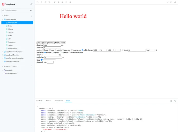
- Storybook
Storybook is a tool for developing and testing UI components in isolation. It provides a sandbox environment where you can experiment with different props and states to see how your component responds.
- Typescript

TypeScript is a superset of JavaScript, providing optional static typing, classes, interfaces, and other features that help developers write more maintainable and scalable code. TypeScript's static typing system can catch errors at compile-time, making it easier to build and maintain large applications.