Ember Components
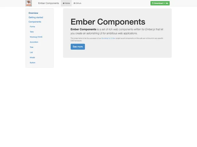
Rich components for Ember.js framework.
Overview
Ember Components offers a robust collection of web components developed entirely in Ember.js, enabling developers to create stunning user interfaces for their web applications. Built with flexibility in mind, these components are designed to meet a wide range of needs and have been successfully utilized in various production environments. The emphasis on purity in design means that these components function independently, without relying on external JavaScript libraries, allowing for a streamlined experience.
With a recent update, Ember Components are now offered separately as individual Ember addons, ensuring that users can tailor their applications without unnecessary bloat. This thoughtful organization makes it easier to implement only the necessary components, helping to keep applications efficient and lightweight.
Features
- Rich Web Components: A comprehensive set of components built for creating visually appealing and functional UIs for ambitious web applications.
- Production-Ready: These components are tried and tested in various production environments, ensuring reliability and performance.
- Pure Ember.js Implementation: All components are crafted purely in Ember.js, eliminating the need for dependencies on external JavaScript libraries.
- Modular Addon Structure: Components are split into separate addons to allow developers to select only what's needed, minimizing app size and improving efficiency.
- Wide Array of Components: Includes addons like forms, buttons, modals, charts, and accordions, catering to diverse development needs.
- Seamless Transition from Bootstrap: These components serve as a modern successor to the Bootstrap for Ember project, providing a fresh and flexible approach without being tied to a specific CSS framework.
- Easy Installation: Simple setup via npm and ember-cli, making it accessible for developers to integrate into their projects quickly.