Mantine Contextmenu V6
The lightweight yet customisable context-menu for your Mantine applications, with a succinct API and dark-theme support. Compatible with Mantine V6.
Overview
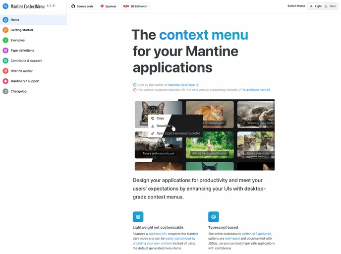
Mantine ContextMenu V6 is a "dark-theme aware" context-menu component for Mantine UI applications. It is designed to be lightweight and has no external dependencies. The context-menu automatically adapts to the current Mantine theme and offers a simple API for easy integration. It supports custom content using any Mantine component and offers highly customizable styling options. The component is written in Typescript and is well-documented.
Features
- Lightweight - no external dependencies, ensuring a fast and efficient performance.
- Dark-theme aware - automatically adjusts to the current Mantine theme, providing a seamless user experience.
- Simple API - easily integrate the ContextMenu component into your application with a straightforward API.
- Custom content support - use any Mantine component as context menu content, allowing for flexible design.
- Highly customizable styling - customize the appearance of the context menu using className/classNames, style/styles, and sx props.
- Written in Typescript and well-documented - the component is built with Typescript and features detailed JSDoc annotations for each exported function and component.
Summary
Mantine ContextMenu V6 is a versatile context-menu component for Mantine UI applications. It offers lightweight and efficient functionality with no external dependencies. The component is "dark-theme aware" and automatically adapts to the current Mantine theme. With a simple API, custom content support, and highly customizable styling options, Mantine ContextMenu V6 provides a seamless and flexible user experience.
- React
React is a widely used JavaScript library for building user interfaces and single-page applications. It follows a component-based architecture and uses a virtual DOM to efficiently update and render UI components
- Mantine UI
A fully featured React components library. 100+ components, 50+ hooks.
- UI Kits & Components

A UI kit provides developers with a set of reusable components that can be easily integrated into a website or application. These components are pre-designed with consistent styling and functionality, allowing developers to save time and effort in the design and development process. UI kits can be either custom-built or third-party, and often include components for buttons, forms, typography, icons, and more.
- Dark Mode
Dark mode is a user interface option that uses a dark color scheme instead of light. It reduces eye strain and improves visibility in low-light conditions. Implementing dark mode in a website or application involves updating the styles and color palette to support both light and dark modes.
- Eslint

ESLint is a linter for JavaScript that analyzes code to detect and report on potential problems and errors, as well as enforce consistent code style and best practices, helping developers to write cleaner, more maintainable code.
- Typescript

TypeScript is a superset of JavaScript, providing optional static typing, classes, interfaces, and other features that help developers write more maintainable and scalable code. TypeScript's static typing system can catch errors at compile-time, making it easier to build and maintain large applications.