Carbon Components Svelte
Svelte implementation of the Carbon Design System
Overview
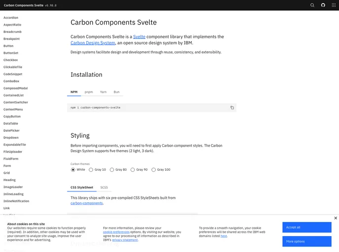
The Carbon Components Svelte is a modern implementation of the Carbon Design System tailored specifically for Svelte applications. As a design system that boasts a comprehensive set of UI components, it provides developers with the tools needed to create consistent, high-quality interfaces that adhere to best practices in design and accessibility. This implementation leverages Svelte's reactive framework, making it a powerful choice for building dynamic web applications.
With Carbon Components Svelte, developers can seamlessly integrate a variety of components into their projects, ensuring not only a great user experience but also a reduction in development time. The thoughtful design behind each component allows for customization while retaining the integrity of the original Carbon design principles, making it a valuable asset for any Svelte-based project.
Features
-
Comprehensive Component Library: Offers a wide range of pre-built components that cover everything from buttons to modal dialogs, facilitating rapid development.
-
Responsive Design: All components are built with a mobile-first approach, ensuring that applications look great on any device.
-
Customization Options: Developers can easily customize components to match their branding and design requirements without sacrificing functionality.
-
Accessibility Focused: Built with accessibility in mind, ensuring that all users, including those with disabilities, can interact with your application.
-
Svelte Reactive Features: Fully integrates with Svelte's reactive features, providing a smooth and efficient development experience.
-
Theming Support: Supports theming capabilities, allowing developers to create variations of components that fit different application themes seamlessly.
-
Well-documented: Comes with thorough documentation that helps developers quickly understand how to implement and utilize each component effectively.
- Svelte
Svelte is a modern front-end framework that compiles your code at build time, resulting in smaller and faster applications. It uses a reactive approach to update the DOM, allowing for high performance and a smoother user experience.
- UI Kits & Components

A UI kit provides developers with a set of reusable components that can be easily integrated into a website or application. These components are pre-designed with consistent styling and functionality, allowing developers to save time and effort in the design and development process. UI kits can be either custom-built or third-party, and often include components for buttons, forms, typography, icons, and more.
- Typescript

TypeScript is a superset of JavaScript, providing optional static typing, classes, interfaces, and other features that help developers write more maintainable and scalable code. TypeScript's static typing system can catch errors at compile-time, making it easier to build and maintain large applications.