Dotting
Dotting is a pixel art editor component library for react
Overview
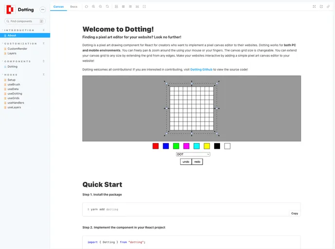
The Dotting component is an innovative tool designed for creating interactive canvases, perfect for artists and developers alike. This component offers incredible flexibility, allowing users to customize their artistic experience with various props. Whether you're building a drawing application or enhancing a creative project, the Dotting component provides an intuitive and powerful way to engage with digital art.
With an easy installation process and straightforward setup, users can quickly integrate this component into their projects. The ability to customize aspects such as size, background color, and visibility of the grid makes this component a valuable addition for anyone looking to enhance their creative workflow.
Features
- Customizable Canvas Size: Easily set the canvas dimensions with the
widthandheightprops, which accept both string and number values for flexibility. - Grid Options: Control the visibility and appearance of the grid with
gridStrokeColorandgridStrokeWidth, allowing users to tailor their workspace to their preferences. - Background Color: The
backgroundColorprop enables users to personalize the canvas background, enhancing the overall artistic experience. - Layer Management: Use the
initLayersprop to define initial drawing layers, providing the option to start with a default layer or customize as needed. - Pan and Zoom Features: If desired, the canvas can be made pan and zoomable by setting
isPanZoomableto true, adding more functionality for detailed work. - Style Customization: The
styleprop facilitates the addition of custom styles to the canvas, ensuring it fits seamlessly into your overall project design. - Ref Hook Integration: For advanced customization, utilize the
refprop with a refObject created usinguseRef<DottingRef>, allowing for further manipulations of the component. - Dynamic Grid Visibility: Control the grid's visibility with the
isGridVisibleprop, giving users the choice to work with or without grid aids.
- React
React is a widely used JavaScript library for building user interfaces and single-page applications. It follows a component-based architecture and uses a virtual DOM to efficiently update and render UI components
- SCSS
SCSS is a preprocessor scripting language that extends the capabilities of CSS by adding features such as variables, nesting, and mixins. It allows developers to write more efficient and maintainable CSS code, and helps to streamline the development process by reducing repetition and increasing reusability.
- Eslint

ESLint is a linter for JavaScript that analyzes code to detect and report on potential problems and errors, as well as enforce consistent code style and best practices, helping developers to write cleaner, more maintainable code.
- Rollup

RollupJS is a popular and efficient JavaScript module bundler that takes the code from multiple modules and packages them into a single optimized file, minimizing the overall size of the application and improving its performance.
- Typescript

TypeScript is a superset of JavaScript, providing optional static typing, classes, interfaces, and other features that help developers write more maintainable and scalable code. TypeScript's static typing system can catch errors at compile-time, making it easier to build and maintain large applications.