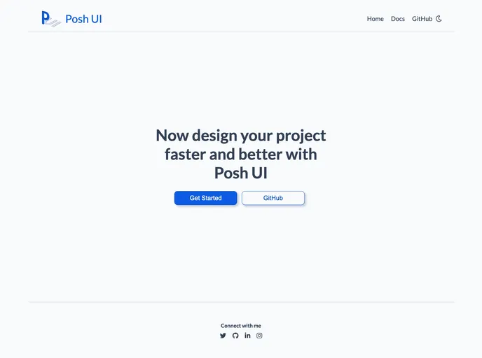
PoshUI Documentation
Posh UI is a continuously developing Component Library, built using HTML5 and CSS3 only.
Overview
Posh UI is a design library that allows users to quickly and efficiently design projects. It offers a wide range of components and features, including alerts, avatars, badges, buttons, cards, CSS grid, images, inputs, lists, modals, navigation, ratings, sliders, toasts, tooltips, and typography. These components can be easily integrated into web projects, making them more interactive and visually appealing.
Features
- Alert: Displays a message to the user. Types of alerts include danger, info, primary, secondary, success, and warning.
- Avatar: Displays a user profile picture. Different types of avatars are available.
- Badge: Shows user status or notification count. Can be added to icons or avatars.
- Button: Used for user interaction on web pages. Includes types such as filled primary, outlined primary, link, icon, and floating buttons.
- Card: Displays content on e-commerce or video library apps. Can also be used to provide user feedback. Types of cards include horizontal text, vertical item, text overlay, and dismiss card with shadow.
- CSS Grid: Helps structure elements in rows and columns. Offers various grid layouts.
- Image: Displays large pictures on websites. Includes round, square, and responsive images.
- Input: Allows users to input information on the website. Types of inputs include text area, form input, and error form input.
- List: Displays lists of items. Includes numbered, reversed, lower roman, lower alpha, disc, circle, square, category checkbox, price radio, and notification stacked lists.
- Modal: Creates dialog boxes for user interaction.
Summary
Posh UI is a powerful design library that offers a wide range of components and features to enhance web projects. With its easy installation process and customizable options, users can quickly design and implement interactive and visually appealing websites. Whether you need to display alerts, create user profiles, add interactive buttons, or structure elements using CSS grid, Posh UI has you covered. Its comprehensive documentation provides all the necessary information and examples to get started quickly.
- HTML
HTML templates are pre-designed and pre-built web pages that can be customized and used as a basis for building websites. They often include common elements such as headers, footers, menus, and content sections, and can be easily edited using HTML and CSS to fit specific branding and content needs.
- UI Kits & Components

A UI kit provides developers with a set of reusable components that can be easily integrated into a website or application. These components are pre-designed with consistent styling and functionality, allowing developers to save time and effort in the design and development process. UI kits can be either custom-built or third-party, and often include components for buttons, forms, typography, icons, and more.