Aurora
Proclub Design System written in React; may you bring your idea to life
## Overview
Aurora is an innovative Proclub Design System built using React, designed to streamline the process of bringing ideas to life. With a focus on flexibility and efficiency, this design system provides developers with the essential tools and components needed to create stunning user interfaces with ease.

Whether you're a seasoned developer or just starting your journey, Aurora's comprehensive features allow you to harness the power of React to craft responsive and visually appealing applications. The clean and modular architecture ensures that you can implement your designs quickly and effectively.

## Features
- **React-Based**: Built entirely on React, ensuring seamless integration with modern web applications and providing enhanced performance.
- **Modular Components**: Offers a wide range of reusable components that can be easily customized to align with your specific design requirements.
- **Responsive Design**: Emphasizes mobile-first design principles, ensuring that your applications look great on devices of all sizes.
- **Theming Support**: Easily switch between themes or create your own, allowing for a unique brand experience across applications.
- **Comprehensive Documentation**: Extensive guides and examples to help developers at all levels understand and implement the design system effectively.
- **Community Driven**: Regular updates and contributions from a vibrant community, ensuring that the system evolves with the latest trends and best practices.
- **Accessibility Focused**: Built with accessibility in mind, making sure your applications are usable for everyone regardless of their abilities.
- Create React App
Create React App is a popular tool for quickly setting up a new React project without the need for manual configuration or setup. It provides a preconfigured development environment with modern build tools, a live development server, and an easy-to-use command line interface.
- React
React is a widely used JavaScript library for building user interfaces and single-page applications. It follows a component-based architecture and uses a virtual DOM to efficiently update and render UI components
- SCSS
SCSS is a preprocessor scripting language that extends the capabilities of CSS by adding features such as variables, nesting, and mixins. It allows developers to write more efficient and maintainable CSS code, and helps to streamline the development process by reducing repetition and increasing reusability.
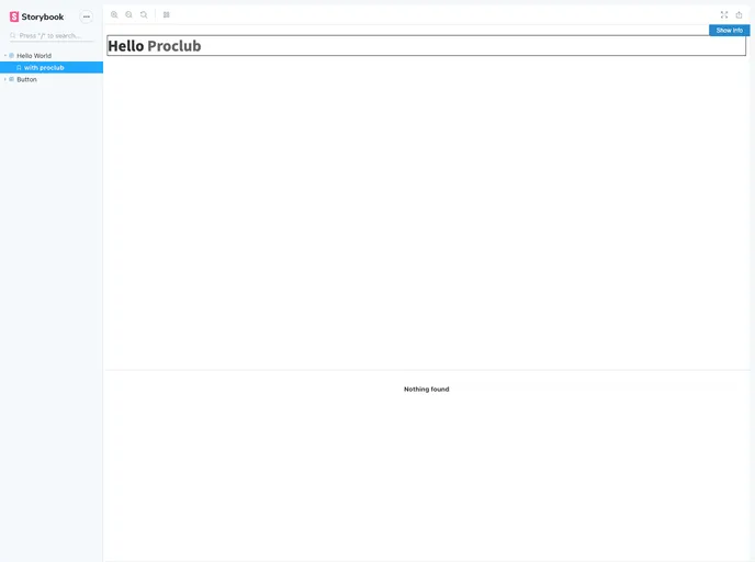
- Storybook
Storybook is a tool for developing and testing UI components in isolation. It provides a sandbox environment where you can experiment with different props and states to see how your component responds.
- Webpack

Webpack is a popular open-source module bundler for JavaScript applications that bundles and optimizes the code and its dependencies for production-ready deployment. It can also be used to transform other types of assets such as CSS, images, and fonts.