Enchanted React Components
Enchanted React Components is a collection of ui components that are being used in HCL Software products.
Overview
Enchanted React Components is a robust library that brings a suite of UI components specifically designed for HCL Software products. Built on top of the popular Material UI Component Library, this collection not only enhances user experience with its visually appealing elements but also ensures ease of integration into any React project. With its focus on modularity and flexibility, developers can create complex interfaces with simplicity and efficiency.
The structure of the library is well-organized, providing atomic, composite, and prerequisite components that make it easier to build and maintain applications. In addition to a solid base of components, Enchanted React Components emphasizes theming and RTL support, catering to diverse user needs.
Features
-
Atomic Components: These are the smallest building blocks, such as Buttons and Panels, which can be combined to create more complex components.
-
Composite Components: Formed from atomic components, these elements help create larger, more functional pieces like specific Forms.
-
Theming Support: Comes with LightNeutralGrey and LightCoolGrey themes, with plans for additional Dark themes, allowing for a personalized UI experience.
-
RTL Support: Fully supports right-to-left languages, ensuring accessibility for diverse users worldwide.
-
Modular Exports: Each component folder includes an index.ts file for streamlined local and global exports, enhancing code readability and maintainability.
-
Development Utilities: Offers a comprehensive set of NPM commands for installation, building, linting, and testing, facilitating a smooth development workflow.
-
Built-in Storybook: Allows for easy visualization and testing of components, making it simpler for developers to showcase UI elements during development.
-
Strict Dependency Management: Employs version control for important dependencies to ensure stability and consistent performance across projects.
- React
React is a widely used JavaScript library for building user interfaces and single-page applications. It follows a component-based architecture and uses a virtual DOM to efficiently update and render UI components
- Material UI
material-ui adds classes to Tailwind CSS for all common UI components. Classes like btn, card, etc. This allows us to focus on important things instead of making basic elements for every project.
- UI Kits & Components

A UI kit provides developers with a set of reusable components that can be easily integrated into a website or application. These components are pre-designed with consistent styling and functionality, allowing developers to save time and effort in the design and development process. UI kits can be either custom-built or third-party, and often include components for buttons, forms, typography, icons, and more.
- Eslint

ESLint is a linter for JavaScript that analyzes code to detect and report on potential problems and errors, as well as enforce consistent code style and best practices, helping developers to write cleaner, more maintainable code.
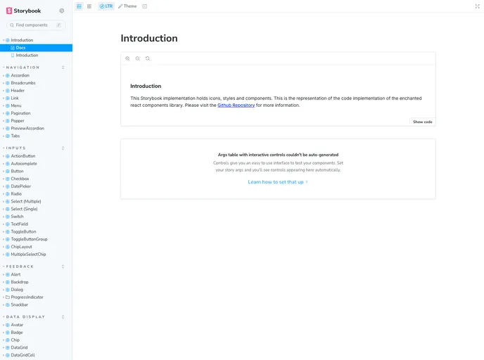
- Storybook
Storybook is a tool for developing and testing UI components in isolation. It provides a sandbox environment where you can experiment with different props and states to see how your component responds.
- Typescript

TypeScript is a superset of JavaScript, providing optional static typing, classes, interfaces, and other features that help developers write more maintainable and scalable code. TypeScript's static typing system can catch errors at compile-time, making it easier to build and maintain large applications.
- Webpack

Webpack is a popular open-source module bundler for JavaScript applications that bundles and optimizes the code and its dependencies for production-ready deployment. It can also be used to transform other types of assets such as CSS, images, and fonts.