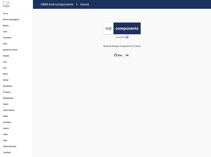
Md Components
Material Design React Components
Overview
md-components is an innovative library designed to facilitate the development of user interfaces following Google's Material Design principles. It's especially useful for developers looking to maintain consistency in their application while utilizing a sleek, modern aesthetic. With a range of features designed to simplify theming and component integration, it streamlines the design process for both seasoned developers and those new to front-end programming.
The library is built with flexibility in mind, enabling customization and easy integration into existing projects. As it supports Sass and adheres to the SUIT CSS guidelines, developers can enjoy a clean structure while enjoying the benefit of modern styling tools.
Features
-
Custom Theming: Implement a unique color palette using six customizable colors, including primary and accent colors, for a tailored look.
-
Font Compatibility: Requires the 'Roboto' font to be added separately, ensuring a clean and modern typographical approach.
-
Style Management: Incorporates Sass to manage styles efficiently, allowing for easy modifications and organization of stylesheets.
-
Material Design Colors: Access to the official Google Material color palette, providing a base for creating visually appealing UI components.
-
IE11 Support: Compatible with Internet Explorer 11 provided you include the necessary polyfills, making it versatile for a wide range of users.
-
Webpack Compatibility: Designed to work seamlessly with Webpack as a module bundler, ensuring smooth integration into development environments.
-
Real-time Compilation: Supports watching for changes during development, enabling instant feedback and a more efficient workflow.
-
Examples Directory: Includes a dedicated examples folder for linking md-components, facilitating experimentation and learning.
- React
React is a widely used JavaScript library for building user interfaces and single-page applications. It follows a component-based architecture and uses a virtual DOM to efficiently update and render UI components
- SCSS
SCSS is a preprocessor scripting language that extends the capabilities of CSS by adding features such as variables, nesting, and mixins. It allows developers to write more efficient and maintainable CSS code, and helps to streamline the development process by reducing repetition and increasing reusability.
- Material Design

Material Design is a design system developed by Google that provides a set of guidelines, components, and tools for creating visually appealing and functional user interfaces. Material Design is designed to be flexible and customizable, making it a great choice for a wide range of applications and use cases.
- Stylelint
Stylelint is a modern linter for CSS that helps you avoid errors and enforce consistent styling conventions. It provides rules for detecting errors and warnings, and can be configured to match your specific project's requirements.