Component Library
Official component library and storybook for Hack Oregon
Overview
Hack Oregon's React Component Library version 0.2.5 is an innovative tool aimed at providing consistent, reusable components for various projects. Still in development, this library seeks to unify platform components along with a comprehensive style guide and data visualization elements. By utilizing CSS Modules, it adopts a modern approach to styling that promises to facilitate cross-project compatibility.
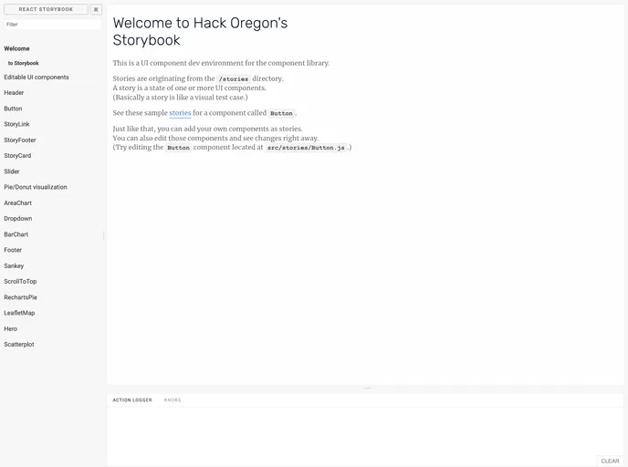
The library is primarily built using React Storybook, which allows developers to create and maintain components in an interactive environment. Its collaborative nature, evident in the clear guidelines for contributions, underscores a community-driven approach to building robust resources for developers.
Features
- Cross-Project Compatibility: Components are designed to be reusable across various projects, enhancing productivity and consistency.
- Integrated Style Guide: A comprehensive style guide accompanies the components, aiding developers in adhering to best practices for design and styling.
- Built with React Storybook: The use of React Storybook enables easy development and management of components and provides interactive examples for better understanding.
- Modular CSS Styling: Utilizing CSS Modules ensures that styles are scoped locally, preventing clashes and easing debugging.
- Development Environment Setup: Easy to set up with Node Version Manager (NVM) and yarn, streamlining the installation process.
- Hot Module Replacement: The development environment supports hot module replacement, allowing developers to see changes in real time without a full reload.
- Comprehensive Documentation: Documentation, along with visual examples for each component, will be readily available, helping users to get started quickly.
- Active Community Contribution: The project encourages contributions from developers, with clear guidelines for adding features and fixing issues, fostering a collaborative ecosystem.
- React
React is a widely used JavaScript library for building user interfaces and single-page applications. It follows a component-based architecture and uses a virtual DOM to efficiently update and render UI components
- Styled Components
Styled Components is a popular library for styling React components using CSS syntax. It allows you to write CSS in your JavaScript code, making it easier to create dynamic styles that are specific to each component.
- UI Kits & Components

A UI kit provides developers with a set of reusable components that can be easily integrated into a website or application. These components are pre-designed with consistent styling and functionality, allowing developers to save time and effort in the design and development process. UI kits can be either custom-built or third-party, and often include components for buttons, forms, typography, icons, and more.
- Eslint

ESLint is a linter for JavaScript that analyzes code to detect and report on potential problems and errors, as well as enforce consistent code style and best practices, helping developers to write cleaner, more maintainable code.
- Recharts

Recharts is a powerful and easy-to-use React library for building customizable and interactive charts. Built on D3.js, it offers a wide range of pre-built chart types, such as line, bar, pie, and scatter charts, all of which can be composed with a declarative syntax.
- Webpack

Webpack is a popular open-source module bundler for JavaScript applications that bundles and optimizes the code and its dependencies for production-ready deployment. It can also be used to transform other types of assets such as CSS, images, and fonts.