Gle Components
GLE Component Library
Overview:
GLE Components is a basic component library that provides developers with a set of reusable UI components. It aims to simplify the development process by offering a collection of pre-built components that can be easily integrated into any project. With clear documentation and a user-friendly interface, GLE Components makes it easy for developers to create consistent and visually appealing user interfaces.
Features:
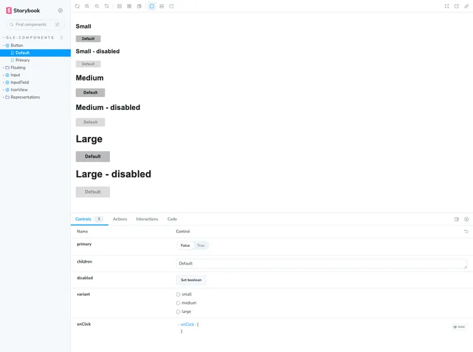
- Reusable UI Components: GLE Components offers a wide range of reusable UI components including buttons, forms, cards, modals, and more. These components can be easily customized to fit the specific needs of a project.
- Clear Documentation: The library comes with detailed documentation that provides developers with a comprehensive understanding of the available components and their implementation. The documentation includes examples, usage guidelines, and troubleshooting tips.
- User-friendly Interface: GLE Components provides a user-friendly interface that allows developers to quickly and efficiently browse through the available components. The interface includes search functionality, filters, and a preview option for each component.
Summary:
GLE Components is a valuable resource for developers looking to streamline their UI development process. With a wide range of reusable components, clear documentation, and a user-friendly interface, it allows for the quick and efficient creation of visually appealing interfaces. By following the installation guide, developers can easily integrate GLE Components into their projects and take advantage of its benefits.