Material Web Components React
Material Web Components for React
Overview
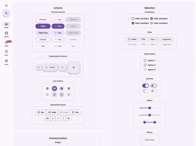
Material Web Components for React is an innovative wrapper designed to integrate seamlessly with the React ecosystem, providing a customizable and accessible approach to Material Design standards. Utilizing the official web components from Google, this library aims to enhance the development experience by ensuring that React developers have access to the latest UI components with ease. Whether you are starting a new project or looking to enrich an existing application, the combination of robust functionality and open-source availability makes it an attractive choice.
This library is particularly recommended for use alongside MUI, creating a powerful development synergy. With an emphasis on local installation and open-source contributions, Material Web Components for React invites developers not just to use the library but to participate in its evolution, ensuring a product that remains responsive to the community’s needs.
Features
-
Open Source: Material Web Components for React is free to use and modify, with a strong community backing for ongoing improvements.
-
Customizable: The library allows developers to tailor components as per their project requirements, ensuring flexibility with design and functionality.
-
Accessibility First: Designed with accessibility in mind, the components conform to web standards, making applications usable by everyone.
-
MUI Compatibility: Recommended to be used alongside MUI, this integration allows for a more powerful UI toolkit that developers can leverage.
-
Local Development: Simplifies the development process with a setup that allows for local installations and quick component integration into React applications.
-
Robust Roadmap: An active development roadmap with planned features such as theming through Tailwind and enhanced TypeScript support keeps the library on the cutting edge of modern web development.
-
Native Web Component Support: By utilizing native web components, the library ensures high performance and lower overhead in managing component states.
-
Community Contributions: Actively encourages developers to participate in enhancing the library, with clear guidelines for contributing and improving components.
- React
React is a widely used JavaScript library for building user interfaces and single-page applications. It follows a component-based architecture and uses a virtual DOM to efficiently update and render UI components
- Material UI
material-ui adds classes to Tailwind CSS for all common UI components. Classes like btn, card, etc. This allows us to focus on important things instead of making basic elements for every project.
- UI Kits & Components

A UI kit provides developers with a set of reusable components that can be easily integrated into a website or application. These components are pre-designed with consistent styling and functionality, allowing developers to save time and effort in the design and development process. UI kits can be either custom-built or third-party, and often include components for buttons, forms, typography, icons, and more.
- Material Design

Material Design is a design system developed by Google that provides a set of guidelines, components, and tools for creating visually appealing and functional user interfaces. Material Design is designed to be flexible and customizable, making it a great choice for a wide range of applications and use cases.
- Typescript

TypeScript is a superset of JavaScript, providing optional static typing, classes, interfaces, and other features that help developers write more maintainable and scalable code. TypeScript's static typing system can catch errors at compile-time, making it easier to build and maintain large applications.
- Web Components

Web components provide a way to create reusable, encapsulated UI components using standard web technologies such as HTML, CSS, and JavaScript. They allow developers to create complex UI components that can be easily shared across multiple projects and frameworks. Web components are built using four main specifications: Custom Elements, Shadow DOM, HTML Templates, and ES Modules.