UI
Universal headless components for React, Next.js & React Native with optional styling
Overview:
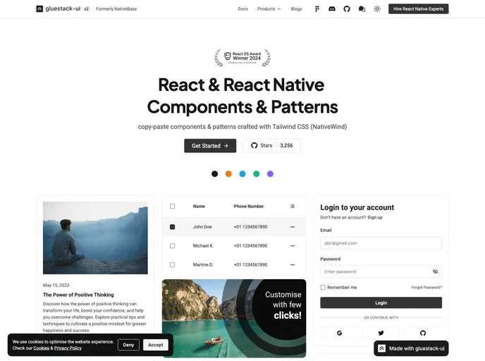
gluestack/ui is a library that provides a collection of accessible, customizable, and reusable components for building user interfaces with React and React Native. The components are designed to be easy to use and integrate into existing React applications. The library is well-documented and offers comprehensive documentation for each component, including a list of props and examples. It also provides frequent updates, adding new components to stay up-to-date with the latest releases and features. Community support is available through a Discord channel.
Features:
- Customizable components: Each component in the library comes with a set of customizable props to tailor its appearance and behavior.
- Responsive design: The components are built using modern web design principles and are fully responsive, ensuring seamless functionality across various devices and screen sizes.
- Well-documented: The library offers comprehensive documentation for each component, including a list of props and examples, making it easy to get started quickly.
- Easy to use: Integrating the components into existing React applications is straightforward. Install the library and import the required components.
- Frequent updates: The library is actively maintained, with regular updates that include new components and features. Stay informed by following the GitHub repository.
- Community support: Join the Discord channel to seek help and connect with other users of the library.
Summary:
gluestack/ui is a library that offers customizable and reusable components for building user interfaces with React and React Native. It provides a range of features including responsive design, comprehensive documentation, ease of use, frequent updates, and community support. Installing and integrating the library is straightforward, making it a convenient choice for developers looking for accessible UI components.
- React
React is a widely used JavaScript library for building user interfaces and single-page applications. It follows a component-based architecture and uses a virtual DOM to efficiently update and render UI components
- React Native
React Native is a framework for building mobile applications using React and JavaScript. It enables developers to write once and deploy to multiple platforms, including iOS, Android, and the web, while providing a native app-like experience to users.
- Styled Components
Styled Components is a popular library for styling React components using CSS syntax. It allows you to write CSS in your JavaScript code, making it easier to create dynamic styles that are specific to each component.
- UI Kits & Components

A UI kit provides developers with a set of reusable components that can be easily integrated into a website or application. These components are pre-designed with consistent styling and functionality, allowing developers to save time and effort in the design and development process. UI kits can be either custom-built or third-party, and often include components for buttons, forms, typography, icons, and more.
- Eslint

ESLint is a linter for JavaScript that analyzes code to detect and report on potential problems and errors, as well as enforce consistent code style and best practices, helping developers to write cleaner, more maintainable code.
- Expo
An open-source platform for making universal native apps with React. Expo runs on Android, iOS, and the web.
- Typescript

TypeScript is a superset of JavaScript, providing optional static typing, classes, interfaces, and other features that help developers write more maintainable and scalable code. TypeScript's static typing system can catch errors at compile-time, making it easier to build and maintain large applications.