Glints Aries
React UI Framework built with React and Styled-components
Overview
Glints Aries is a powerful front-end framework specifically designed to enhance and accelerate the development process for React applications. Developed by the skilled engineers at Glints, this framework incorporates Styled Components to facilitate a visually appealing and responsive interface. As an ongoing project, Glints Aries continually evolves, integrating new features and components to meet the evolving needs of developers.
Whether you’re starting a new project or looking to streamline an existing one, Glints Aries offers an array of tools that cater to diverse development requirements. With its emphasis on simplicity and efficiency, it aims to provide an optimal user experience across various devices.
Features
-
Responsive Design with GlintsContainer: Wrap your root component with
<GlintsContainer />for automatic adaptation to screen size, ensuring a seamless experience on any device. -
Easy Installation: Requires basic tools like git, node (version ≥ 14), and yarn. Get up and running quickly by cloning the repository and installing project dependencies.
-
Local Testing Options: Use
yalcto test local changes within your projects, with proper linking procedures that facilitate integration without extensive setup. -
Visual Regression Testing: Implement playwright visual comparison testing for components, ensuring consistent rendering across different browsers and platforms.
-
Accessible Code Structure: Maintain an organized codebase with clear import structures and standardized formatting practices, promoting ease of navigation and collaboration.
-
Ongoing Development: Actively receive updates from the Glints team, with additional components and features being developed to enhance functionality and user experience.
-
Comprehensive Documentation: Enjoy easy access to detailed instructions and examples that simplify the development process, allowing you to focus on building quality applications.
- React
React is a widely used JavaScript library for building user interfaces and single-page applications. It follows a component-based architecture and uses a virtual DOM to efficiently update and render UI components
- Styled Components
Styled Components is a popular library for styling React components using CSS syntax. It allows you to write CSS in your JavaScript code, making it easier to create dynamic styles that are specific to each component.
- Eslint

ESLint is a linter for JavaScript that analyzes code to detect and report on potential problems and errors, as well as enforce consistent code style and best practices, helping developers to write cleaner, more maintainable code.
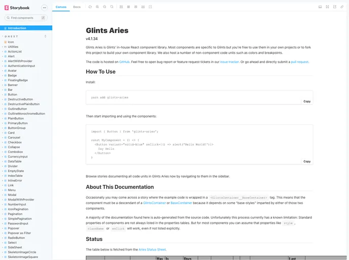
- Storybook
Storybook is a tool for developing and testing UI components in isolation. It provides a sandbox environment where you can experiment with different props and states to see how your component responds.
- Stylelint
Stylelint is a modern linter for CSS that helps you avoid errors and enforce consistent styling conventions. It provides rules for detecting errors and warnings, and can be configured to match your specific project's requirements.
- Typescript

TypeScript is a superset of JavaScript, providing optional static typing, classes, interfaces, and other features that help developers write more maintainable and scalable code. TypeScript's static typing system can catch errors at compile-time, making it easier to build and maintain large applications.
- Webpack

Webpack is a popular open-source module bundler for JavaScript applications that bundles and optimizes the code and its dependencies for production-ready deployment. It can also be used to transform other types of assets such as CSS, images, and fonts.