React Mobile App Button
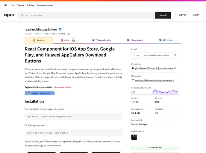
Welcome to our versatile React component designed to seamlessly integrate download buttons for iOS App Store, Google Play Store, and Huawei AppGallery. Enhance your users' experience by providing effortless access to your mobile app on popular platforms. Elevate your app's visibility and accessib...
Overview
The React component designed for integrating download buttons is a game-changer for developers looking to enhance user accessibility to mobile applications. Whether you are targeting users on iOS, Android, or Huawei, this component ensures that your app can be easily accessed through prominent download platforms. By simplifying the process of adding download buttons to your web pages, it boosts your app's visibility effortlessly.
With the ability to customize and arrange multiple buttons, this component not only enriches the aesthetic of your application but also offers a seamless user experience. The straightforward implementation makes it a valuable addition for developers aiming to elevate their app’s functionality and outreach.
Features
- Multi-Platform Support: Easily integrate download buttons for the iOS App Store, Google Play Store, and Huawei AppGallery, ensuring wide accessibility for users.
- Customization Options: Tailor the appearance of buttons with props for themes (light/dark), height, width, and custom class names to fit your web design.
- Flexible Layout Control: Customize button arrangement and spacing using props like
gapanddirection, allowing for both row and column layouts as needed. - User-Friendly Installation: Quick installation via npm or Yarn makes it easy to set up in your project and start enhancing user engagement.
- Documentation: Comprehensive documentation provides clear guidance on component usage, making integration and customization straightforward.
- Support Availability: Reach out for assistance easily through provided email and issue tracker details, ensuring help is there when you need it.
- Next.js
Next.js is a React-based web framework that enables server-side rendering, static site generation, and other powerful features for building modern web applications.
- React
React is a widely used JavaScript library for building user interfaces and single-page applications. It follows a component-based architecture and uses a virtual DOM to efficiently update and render UI components
- React Native
React Native is a framework for building mobile applications using React and JavaScript. It enables developers to write once and deploy to multiple platforms, including iOS, Android, and the web, while providing a native app-like experience to users.
- Vite
Vite is a build tool that aims to provide a faster and leaner development experience for modern web projects
- Styled Components
Styled Components is a popular library for styling React components using CSS syntax. It allows you to write CSS in your JavaScript code, making it easier to create dynamic styles that are specific to each component.
- Storybook
Storybook is a tool for developing and testing UI components in isolation. It provides a sandbox environment where you can experiment with different props and states to see how your component responds.