Antd UI Components
Overview:
InMarketUI is an open-source project that welcomes contributions from developers seeking to build or improve components for UI applications. The project is licensed under the MIT License.
Features:
- Open-source: InMarketUI is an open-source project that allows developers to contribute and improve its components.
- Contributing guide: InMarketUI provides a comprehensive contributing guide to help developers contribute to the project effectively.
- License: The project is offered under the MIT License, allowing developers to use, modify, and distribute the code.
Summary:
InMarketUI is an open-source project that provides a collection of UI components for developers to contribute and improve upon. With a comprehensive contributing guide and the MIT License, InMarketUI encourages collaboration and flexibility in building UI applications.
- React
React is a widely used JavaScript library for building user interfaces and single-page applications. It follows a component-based architecture and uses a virtual DOM to efficiently update and render UI components
- LESS
Less CSS is a dynamic stylesheet language that extends the capabilities of CSS, allowing developers to write cleaner, more modular, and reusable stylesheets with features like variables, mixins, and nested rules.
- SCSS
SCSS is a preprocessor scripting language that extends the capabilities of CSS by adding features such as variables, nesting, and mixins. It allows developers to write more efficient and maintainable CSS code, and helps to streamline the development process by reducing repetition and increasing reusability.
- Ant Design
Ant Design is a React UI library that provides a set of pre-designed components and design resources for building high-quality, responsive web applications.
- UI Kits & Components

A UI kit provides developers with a set of reusable components that can be easily integrated into a website or application. These components are pre-designed with consistent styling and functionality, allowing developers to save time and effort in the design and development process. UI kits can be either custom-built or third-party, and often include components for buttons, forms, typography, icons, and more.
- Postcss

PostCSS is a popular open-source tool that enables web developers to transform CSS styles with JavaScript plugins. It allows for efficient processing of CSS styles, from applying vendor prefixes to improving browser compatibility, ultimately resulting in cleaner, faster, and more maintainable code.
- Rollup

RollupJS is a popular and efficient JavaScript module bundler that takes the code from multiple modules and packages them into a single optimized file, minimizing the overall size of the application and improving its performance.
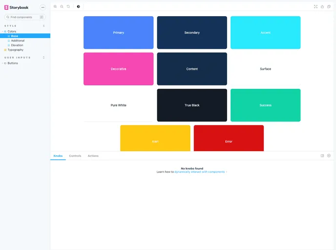
- Storybook
Storybook is a tool for developing and testing UI components in isolation. It provides a sandbox environment where you can experiment with different props and states to see how your component responds.