Sugui Design System
A design system template for the SugUI components library based on styleguidist
Overview
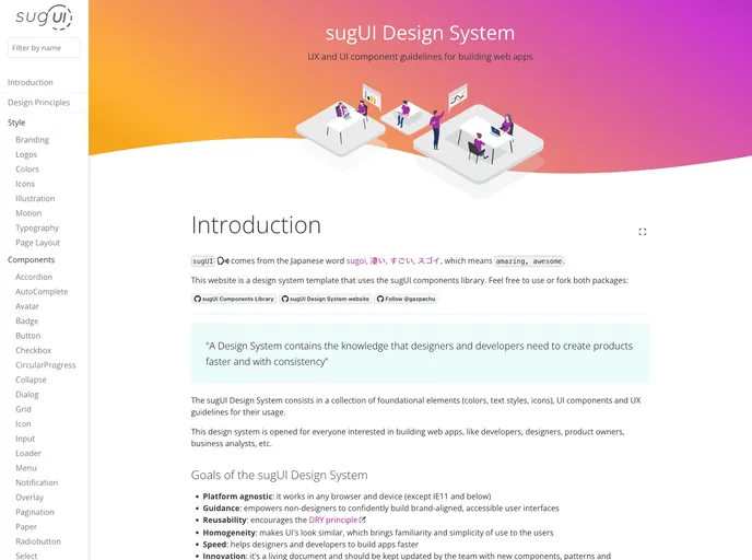
The sugUI Design System is a robust package designed to work seamlessly with the sugUI components library. It's an ideal tool for developers looking to create a custom design system tailored to their specific needs. With detailed setup instructions and features that enhance productivity, this package makes it easier than ever to integrate and develop user interfaces.
Setting up a local environment for the sugUI Design System can be straightforward with the right guidance. Developers can fork the repository to initiate their design systems while taking advantage of features like hot reloading to boost their workflow efficiently.
Features
- Customizable Design System: Fork the repository to tailor the design system using the sugUI components library.
- Local Environment Setup: Clear instructions to establish a working environment that supports both the design system and sugUI components.
- Hot Reloading: Modify your components and see instant changes during development, enhancing your build process.
- Easy Integration: Symbolic linking allows seamless reference to your custom sugUI library within the node_modules.
- Deployment Ready: Simple deployment options to Github Pages to showcase your design system with minimal effort.
- User-Friendly Guide: Provides a comprehensive setup guide for both beginners and experienced developers, ensuring a smooth start.
- React
React is a widely used JavaScript library for building user interfaces and single-page applications. It follows a component-based architecture and uses a virtual DOM to efficiently update and render UI components
- Styled Components
Styled Components is a popular library for styling React components using CSS syntax. It allows you to write CSS in your JavaScript code, making it easier to create dynamic styles that are specific to each component.
- UI Kits & Components

A UI kit provides developers with a set of reusable components that can be easily integrated into a website or application. These components are pre-designed with consistent styling and functionality, allowing developers to save time and effort in the design and development process. UI kits can be either custom-built or third-party, and often include components for buttons, forms, typography, icons, and more.
- Eslint

ESLint is a linter for JavaScript that analyzes code to detect and report on potential problems and errors, as well as enforce consistent code style and best practices, helping developers to write cleaner, more maintainable code.
- GitHub Pages

Gridsome is a Vue.js-based static site generator that makes it easy to build fast and flexible websites and applications by leveraging modern web technologies like GraphQL, Webpack, and hot reloading
- Webpack

Webpack is a popular open-source module bundler for JavaScript applications that bundles and optimizes the code and its dependencies for production-ready deployment. It can also be used to transform other types of assets such as CSS, images, and fonts.