Sugui
UI Components library based on React, Styled Components and React Testing Library
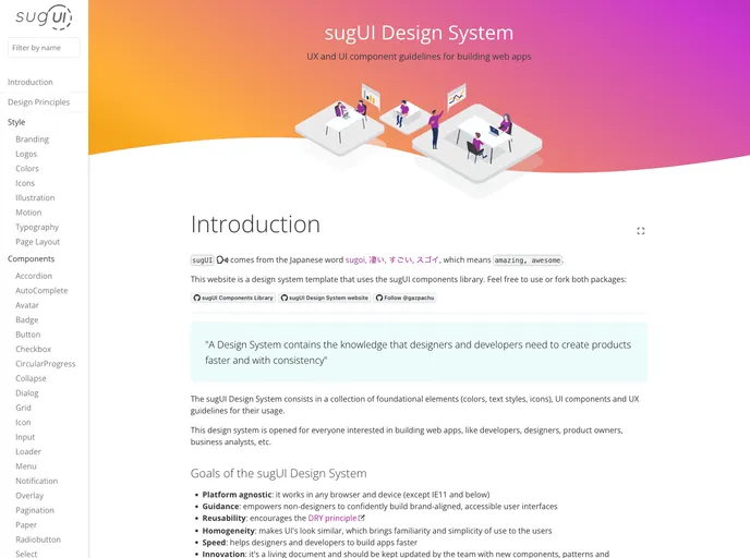
Overview
SugUI is a modern UI components library tailored for React applications, offering a streamlined and efficient way to build user interfaces. With its foundation on Styled Components and the React testing library, SugUI promises both flexibility and robustness, making it a compelling choice for developers looking to enhance their projects with cohesive design elements.
Installation is a breeze using npm, which allows developers to quickly integrate the library into their existing workflows. For those who value community collaboration, SugUI is open-source, inviting contributions and encouraging developers to enhance and expand its capabilities.
Features
- Easy Installation: Simply run
npm i sugui -Sin your project folder to quickly set up the library. - Component Variety: Offers a diverse set of pre-built UI components that streamline the design process.
- Styled Components Support: Leverages Styled Components for styling, ensuring that your UI is not only functional but also visually appealing.
- React Testing Integration: Compatible with the React testing library, making it easier to write tests and ensure the reliability of your components.
- Open Source: As an open-source library, it encourages contributions from the community, allowing for continuous improvement and innovation.
- Design System Reference: Provides access to a design system website, facilitating easy learning and implementation of components and icons.
- React
React is a widely used JavaScript library for building user interfaces and single-page applications. It follows a component-based architecture and uses a virtual DOM to efficiently update and render UI components
- Styled Components
Styled Components is a popular library for styling React components using CSS syntax. It allows you to write CSS in your JavaScript code, making it easier to create dynamic styles that are specific to each component.
- UI Kits & Components

A UI kit provides developers with a set of reusable components that can be easily integrated into a website or application. These components are pre-designed with consistent styling and functionality, allowing developers to save time and effort in the design and development process. UI kits can be either custom-built or third-party, and often include components for buttons, forms, typography, icons, and more.
- Eslint

ESLint is a linter for JavaScript that analyzes code to detect and report on potential problems and errors, as well as enforce consistent code style and best practices, helping developers to write cleaner, more maintainable code.