Fyndiq UI
Library of reusable web frontend components for Fyndiq
Overview
Fyndiq UI is an extensive library of reusable components designed specifically for React projects. This monorepo, built using Lerna, offers a wide range of components that streamline the development process and enhance the design consistency across applications. With components like alerts, buttons, modals, and more, Fyndiq UI serves as an essential toolkit for developers seeking to build modern interfaces efficiently.
The components come with their own styles, relying on CSSNext, making it simple to integrate them into existing projects. If you're looking for a comprehensive solution to elevate your user interface components, Fyndiq UI presents an appealing option.
Features
- Wide Range of Components: Offers various ready-to-use components like alerts, buttons, modals, and product cards to suit different needs within an application.
- Custom Styles: Each component provides its own styling using CSSNext, ensuring a polished look that integrates neatly with your project.
- Monorepo Structure: Built with Lerna, allowing for organized package management and easy updates across several components.
- Easy Installation: Simply install one of the provided packages into your React project to start using the components.
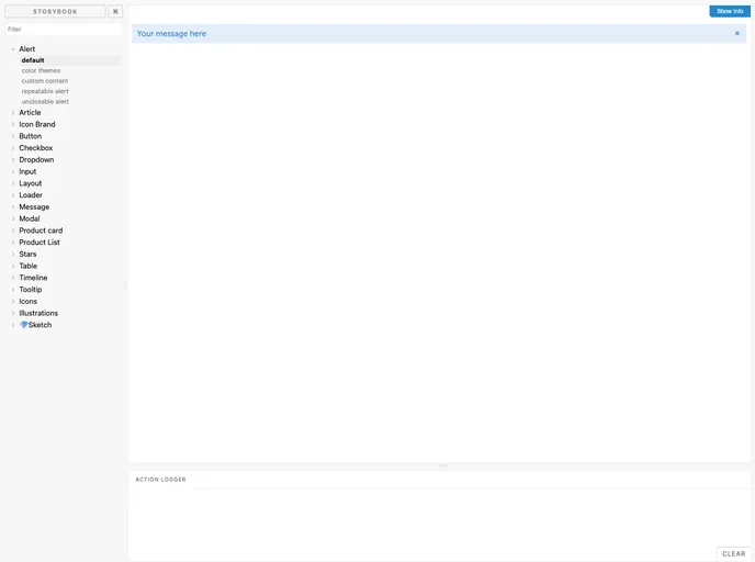
- Storybook Integration: Provides a development environment on port 6006, enabling developers to view and test components interactively.
- Custom Component Creation: Supports the addition of new components, just create a folder and follow simple steps to integrate seamlessly into the library.
- Default Styles: Comes with pre-defined styles for colors, fonts, and media queries, allowing for a cohesive design across different components.
- React
React is a widely used JavaScript library for building user interfaces and single-page applications. It follows a component-based architecture and uses a virtual DOM to efficiently update and render UI components
- UI Kits & Components

A UI kit provides developers with a set of reusable components that can be easily integrated into a website or application. These components are pre-designed with consistent styling and functionality, allowing developers to save time and effort in the design and development process. UI kits can be either custom-built or third-party, and often include components for buttons, forms, typography, icons, and more.
- Eslint

ESLint is a linter for JavaScript that analyzes code to detect and report on potential problems and errors, as well as enforce consistent code style and best practices, helping developers to write cleaner, more maintainable code.
- Storybook
Storybook is a tool for developing and testing UI components in isolation. It provides a sandbox environment where you can experiment with different props and states to see how your component responds.
- Stylelint
Stylelint is a modern linter for CSS that helps you avoid errors and enforce consistent styling conventions. It provides rules for detecting errors and warnings, and can be configured to match your specific project's requirements.
- Webpack

Webpack is a popular open-source module bundler for JavaScript applications that bundles and optimizes the code and its dependencies for production-ready deployment. It can also be used to transform other types of assets such as CSS, images, and fonts.