Functional UI Kit
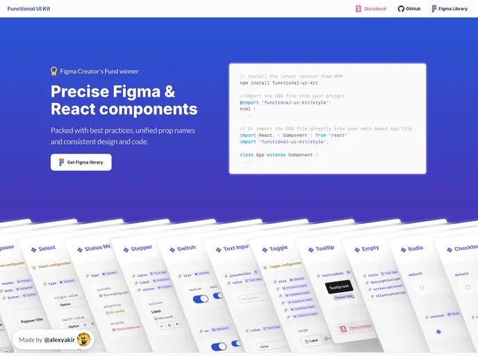
Precise Figma & React components. Packed with best practices, unified prop names & consistent design and code.
Overview
Functional UI Kit is a design system specifically tailored for product design and development teams and individuals. It offers a range of core components that are necessary for any project and places a strong emphasis on accessibility, developer experience, and a seamless designer-developer workflow.
Features
- Figma and CSS Variables: The UI Kit seamlessly integrates Figma variables and CSS variables, ensuring that they share the same names, usage, and inheritance structure. This allows for a cohesive design-to-development transition.
- Direct Mapping: Each Figma variable has a direct counterpart in CSS, eliminating any confusion and maintaining the clarity of design ideas during the development phase.
- Customizable Theme: Users have the ability to customize the theme by overriding the CSS variables. The available list of variables can be found in the theme file.
Summary
Functional UI Kit is a powerful design system that caters to the needs of product design and development teams. Its seamless integration of Figma and CSS variables ensures a unified and efficient workflow. With customizable themes and a comprehensive set of components, Functional UI Kit provides the necessary tools for creating accessible and visually compelling projects.
- Figma
Figma is a cloud-based design tool for creating user interfaces, prototypes, and collaboration in real time.
- React
React is a widely used JavaScript library for building user interfaces and single-page applications. It follows a component-based architecture and uses a virtual DOM to efficiently update and render UI components
- Vite
Vite is a build tool that aims to provide a faster and leaner development experience for modern web projects
- UI Kits & Components

A UI kit provides developers with a set of reusable components that can be easily integrated into a website or application. These components are pre-designed with consistent styling and functionality, allowing developers to save time and effort in the design and development process. UI kits can be either custom-built or third-party, and often include components for buttons, forms, typography, icons, and more.
- Eslint

ESLint is a linter for JavaScript that analyzes code to detect and report on potential problems and errors, as well as enforce consistent code style and best practices, helping developers to write cleaner, more maintainable code.
- Storybook
Storybook is a tool for developing and testing UI components in isolation. It provides a sandbox environment where you can experiment with different props and states to see how your component responds.
- Typescript

TypeScript is a superset of JavaScript, providing optional static typing, classes, interfaces, and other features that help developers write more maintainable and scalable code. TypeScript's static typing system can catch errors at compile-time, making it easier to build and maintain large applications.