Tailwind Flowbite Theming Darkmode Switcher
Tailwindcss/Flowbite starter template with added support for darkmode, theming and contextual colors.
Overview
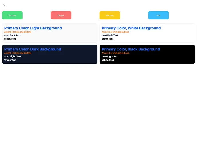
The Tailwind-flowbite-theming-darkmode-switcher is a starter template that combines the popular Tailwindcss and Flowbite libraries. It includes added support for dark mode, theming, and contextual colors. The template provides color themes such as primary, accent, light, dark, success, danger, warning, and info. It also includes JavaScript for components and a dark mode switcher.
Features
- Color Themes: The template offers several color themes, including primary, accent, light, dark, success, danger, warning, and info. Each theme is designed for different elements such as links, buttons, and alerts.
- Prevent Flashing of Wrong Theme: The template includes JavaScript components that prevent any flashing of the wrong theme while switching between different color themes.
- JS for Darkmode Switcher: The template provides a JavaScript script for a dark mode switcher, allowing users to easily toggle between light and dark modes.
- Theme Switcher: The template offers a built-in theme switcher, allowing users to change between different color themes with ease.
Summary
The Tailwind-flowbite-theming-darkmode-switcher is a powerful starter template that combines the functionality of Tailwindcss and Flowbite. It offers support for dark mode, theming, and contextual colors with pre-defined themes. The template also includes JavaScript components for preventing flashing of wrong themes and a dark mode switcher. With its easy installation process and various features, this template provides a solid foundation for creating visually appealing and customizable web interfaces.