Fold
The zero-dependency React UI library for product teams.
Overview
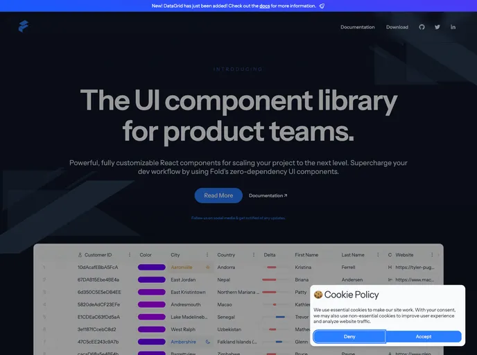
FoldFold offers powerful, fully customizable React components designed to elevate your product development to new heights. With a focus on enhancing your development workflow, these zero-dependency UI components provide robust functionality without the need for additional libraries. Whether you're a startup looking to quickly prototype or an established company aiming to streamline your development process, FoldFold is a compelling solution.
The platform emphasizes ease of use, making it accessible for developers of all skill levels. With comprehensive documentation and theming options, it ensures that you can tailor the components to fit your specific application needs, fostering creativity while maintaining functionality.
Features
- Fully Customizable Components: Create unique user interfaces by tailoring each component to your requirements without the constraints of a rigid framework.
- Zero Dependencies: Simplify your development process by utilizing components that don't require additional libraries, reducing bloat and improving performance.
- Comprehensive Documentation: Access detailed information on each component and their props, ensuring that you can quickly reference guidance as you build.
- Easy Theming Options: Effortlessly apply custom themes to your application, allowing for a cohesive brand identity and user experience.
- Active Community Support: Participate in an inclusive community where you can find help, report bugs, and provide feedback to continuously improve the library.
- Open-source Contribution: Get involved by contributing to the project or voicing suggestions through structured issue templates, fostering an environment of collaboration.
- MIT License: Enjoy the flexibility of an MIT license, enabling you to use, modify, and distribute the components freely.
- React
React is a widely used JavaScript library for building user interfaces and single-page applications. It follows a component-based architecture and uses a virtual DOM to efficiently update and render UI components
- UI Kits & Components

A UI kit provides developers with a set of reusable components that can be easily integrated into a website or application. These components are pre-designed with consistent styling and functionality, allowing developers to save time and effort in the design and development process. UI kits can be either custom-built or third-party, and often include components for buttons, forms, typography, icons, and more.
- Eslint

ESLint is a linter for JavaScript that analyzes code to detect and report on potential problems and errors, as well as enforce consistent code style and best practices, helping developers to write cleaner, more maintainable code.
- Storybook
Storybook is a tool for developing and testing UI components in isolation. It provides a sandbox environment where you can experiment with different props and states to see how your component responds.
- Typescript

TypeScript is a superset of JavaScript, providing optional static typing, classes, interfaces, and other features that help developers write more maintainable and scalable code. TypeScript's static typing system can catch errors at compile-time, making it easier to build and maintain large applications.