Form Components
Easy to use form components
Overview:
The FT-FORM-COMPONENTS is a collection of form components designed for web application development. It includes components such as Button, Input, Steps, Checkbox, RadioButton, and more. The development phase is still ongoing, but the components can be downloaded and tested. This analysis will provide an overview of the features and installation process of the form components.
Features:
- Button: Developed to prevent unnecessary multiple fetch operations during the execution of async functions by handling the "loading" prop.
- Input: Provides modern form elements with different children elements, including InputArea, TextArea, Header, and Warn.
- Steps: A component for creating step-by-step processes in forms.
- Checkbox: Allows users to select multiple options from a list.
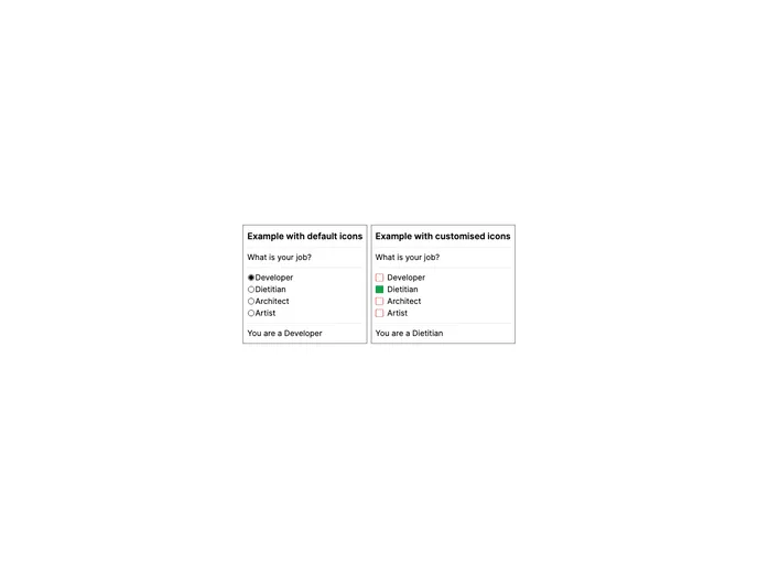
- RadioButton: Allows users to select a single option from a list.
- Image and video picker: A component for selecting images and videos.
- Autocomplete dropdown list: Provides a dropdown list with autocomplete functionality.
- Basic dropdown list: Offers a basic dropdown list for selecting options.
- Masked inputs: Allows users to input formatted values such as phone numbers and credit card numbers.
Summary:
The FT-FORM-COMPONENTS is a collection of form components designed for web application development. It offers a range of features such as Button, Input, Steps, Checkbox, and RadioButton. The installation process involves installing the necessary dependencies and downloading the components. These form components aim to simplify the development of web applications and provide functionalities such as preventing multiple fetch operations, handling input elements, and creating step-by-step processes.