UI
React components library
Overview
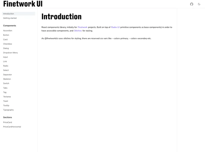
The React components library presents an innovative solution specifically designed for Finetwork projects, providing a robust foundation built on accessibility and versatility. By leveraging Radix-UI primitive components, it ensures that all elements are not just stylish but also functionally accessible, appealing to developers who value inclusivity in their applications. The use of Stitches for styling adds an extra layer of customization, allowing for flexible design implementations.
This library is a great resource for developers looking to streamline their workflow while ensuring that they adhere to best practices in accessibility and usability. With comprehensive documentation and a supportive community, it's easy to get started and integrate these components into various projects.
Features
- Accessibility First: Built on Radix-UI, ensuring all components meet high accessibility standards for all users.
- Custom Styling: Utilizes Stitches for flexible and customizable styles that can fit various application needs.
- Comprehensive Documentation: Detailed documentation available to help developers quickly implement and utilize components.
- Innovative Design: Focused on a modern aesthetic that complements various project styles and enhances user experience.
- Community Driven: Developed with the support of a community, ensuring continued updates and improvements based on user feedback.
- Ease of Installation: Simple npm installation process that allows for quick setup in your development environment.
- Optimized for Performance: Lightweight components that maintain high performance without compromising on features.
- Typescript

TypeScript is a superset of JavaScript, providing optional static typing, classes, interfaces, and other features that help developers write more maintainable and scalable code. TypeScript's static typing system can catch errors at compile-time, making it easier to build and maintain large applications.