Fidely UI
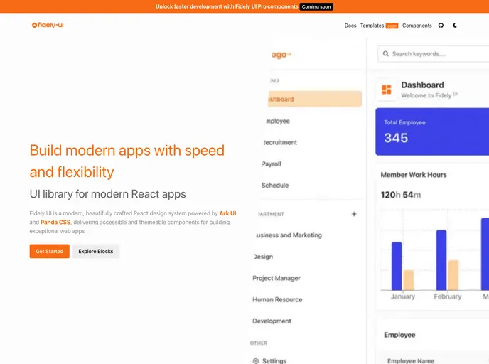
Fidely UI is a modern, beautifully crafted React design system powered by Ark UI and Panda CSS, delivering accessible and themeable components for building exceptional web apps.
Overview
Fidely UI is an exciting React design system designed for developers looking to create modern applications with impressive speed and flexibility. This beautifully crafted framework stands out due to its combination of Ark UI and Panda CSS, ensuring that developers have access to powerful tools while maintaining a focus on accessibility and theming. With a commitment to providing exceptional components, Fidely UI serves as a comprehensive solution for building remarkable web apps.
What sets Fidely UI apart is its focus on the developer experience, making it an attractive choice for those who value customization and accessibility as integral parts of their projects. Its components not only look good but are also designed to meet the usability needs of all users, making the journey of building applications smoother and more efficient.
Features
- Snappy Developer Experience: Designed for speed, Fidely UI enables developers to quickly prototype and build applications without delays.
- Fully Customizable: Leveraging the power of Ark UI and the Panda CSS theme system, users can fully tailor components to their unique design requirements.
- Accessible by Default: Emphasizing inclusivity, Fidely UI incorporates a strong accessibility foundation right from the start, ensuring all users can access your application.
- Composable: This design system allows for easy extension or style overriding, giving developers the flexibility needed to adapt components without compromising their original integrity.
- React
React is a widely used JavaScript library for building user interfaces and single-page applications. It follows a component-based architecture and uses a virtual DOM to efficiently update and render UI components
- Panda CSS
Panda CSS is a CSS-in-JS solution that extracts styles at build time for zero runtime overhead. It provides type-safe style authoring, design tokens, and recipes while outputting optimized static CSS.
- Ark UI
Ark UI is a headless component library from the Chakra team that provides unstyled, accessible UI primitives for building design systems. It works across React, Vue, and Solid, offering a framework-agnostic foundation for creating custom component libraries with full accessibility support.
- UI Kits & Components

A UI kit provides developers with a set of reusable components that can be easily integrated into a website or application. These components are pre-designed with consistent styling and functionality, allowing developers to save time and effort in the design and development process. UI kits can be either custom-built or third-party, and often include components for buttons, forms, typography, icons, and more.
- Eslint

ESLint is a linter for JavaScript that analyzes code to detect and report on potential problems and errors, as well as enforce consistent code style and best practices, helping developers to write cleaner, more maintainable code.
- Typescript

TypeScript is a superset of JavaScript, providing optional static typing, classes, interfaces, and other features that help developers write more maintainable and scalable code. TypeScript's static typing system can catch errors at compile-time, making it easier to build and maintain large applications.