React UI Library
UI Component library example made with React
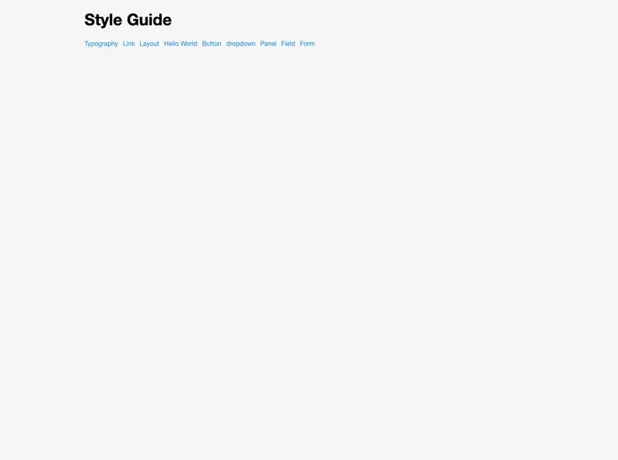
Overview
The React UI Library is a component library made specifically for React applications. It provides a collection of reusable UI components that can be easily integrated into React projects. This library aims to streamline the development process by offering pre-built components that follow best practices and can be customized to fit the project's design requirements.
Features
- Reusable Components: The React UI Library offers a wide range of reusable UI components such as buttons, input fields, modals, and navigation menus.
- Customizable Styles: Each component comes with customizable styles, allowing developers to easily adapt the appearance of the components to match the design of their application.
- Responsive Design: The components in the library are designed to be responsive, ensuring that they look and function seamlessly across different screen sizes and devices.
- Accessibility: The components are built with accessibility in mind, following web accessibility standards to ensure that they can be used by users with disabilities.
- Easy Integration: The library provides clear documentation and examples, making it easy for developers to integrate the components into their React projects.
Summary
The React UI Library is a comprehensive component library designed for React applications. With a focus on reusability, customization, and responsiveness, this library provides developers with a fast and efficient way to build user interfaces. By following best practices and adhering to accessibility standards, the React UI Library ensures that components are easy to integrate and usable for a wide range of users.
- React
React is a widely used JavaScript library for building user interfaces and single-page applications. It follows a component-based architecture and uses a virtual DOM to efficiently update and render UI components
- SCSS
SCSS is a preprocessor scripting language that extends the capabilities of CSS by adding features such as variables, nesting, and mixins. It allows developers to write more efficient and maintainable CSS code, and helps to streamline the development process by reducing repetition and increasing reusability.
- UI Kits & Components

A UI kit provides developers with a set of reusable components that can be easily integrated into a website or application. These components are pre-designed with consistent styling and functionality, allowing developers to save time and effort in the design and development process. UI kits can be either custom-built or third-party, and often include components for buttons, forms, typography, icons, and more.
- Eslint

ESLint is a linter for JavaScript that analyzes code to detect and report on potential problems and errors, as well as enforce consistent code style and best practices, helping developers to write cleaner, more maintainable code.
- GitHub Pages

Gridsome is a Vue.js-based static site generator that makes it easy to build fast and flexible websites and applications by leveraging modern web technologies like GraphQL, Webpack, and hot reloading
- Stylelint
Stylelint is a modern linter for CSS that helps you avoid errors and enforce consistent styling conventions. It provides rules for detecting errors and warnings, and can be configured to match your specific project's requirements.
- Webpack

Webpack is a popular open-source module bundler for JavaScript applications that bundles and optimizes the code and its dependencies for production-ready deployment. It can also be used to transform other types of assets such as CSS, images, and fonts.