Expand Components
Expand component library, modules & ui components
Overview
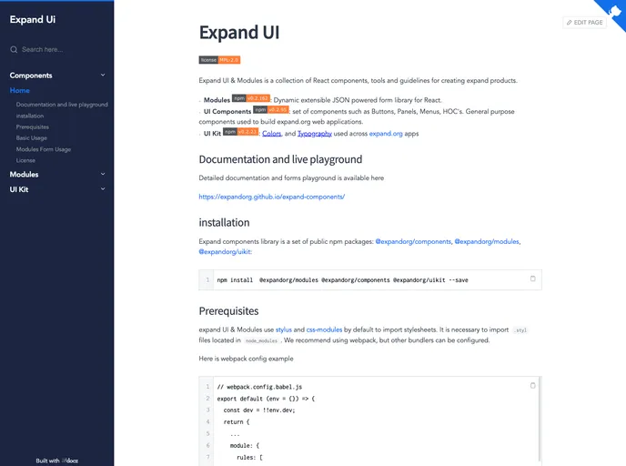
Expand UI & Modules is a collection of React components, tools, and guidelines for creating expandable products. It includes modules for dynamic extensible JSON powered forms, a set of UI components for buttons, panels, menus, and higher-order components (HOCs), as well as a UI kit with predefined colors and typography. The library also provides detailed documentation and a live playground.
Features
- Modules: Dynamic extensible JSON powered form library for React
- UI Components: Set of components such as buttons, panels, menus, and HOCs. Used to build expandable web applications.
- UI Kit: Contains colors and typography used across expandable.org apps
Summary
Expand UI & Modules is a collection of React components, tools, and guidelines for creating expandable products. It includes modules for dynamic extensible JSON-powered forms, a set of UI components for buttons, panels, menus, and higher-order components (HOCs), as well as a UI kit with predefined colors and typography. The theme provides detailed documentation and a live playground for developers. It is licensed under the Mozilla Public License 2.0.
- React
React is a widely used JavaScript library for building user interfaces and single-page applications. It follows a component-based architecture and uses a virtual DOM to efficiently update and render UI components
- UI Kits & Components

A UI kit provides developers with a set of reusable components that can be easily integrated into a website or application. These components are pre-designed with consistent styling and functionality, allowing developers to save time and effort in the design and development process. UI kits can be either custom-built or third-party, and often include components for buttons, forms, typography, icons, and more.
- Eslint

ESLint is a linter for JavaScript that analyzes code to detect and report on potential problems and errors, as well as enforce consistent code style and best practices, helping developers to write cleaner, more maintainable code.