Ethereum React Components
Ethereum Components Library in React
Overview
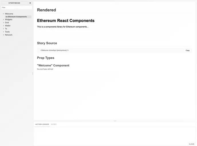
CircleCI Ethereum React Components is a versatile library designed for developers working on Ethereum-related applications. Built with Material-UI, this collection of frequently used components provides a solid foundation for creating modern, responsive user interfaces. While it promises a rich feature set, it's important to note that the library is not yet production-ready, as many of the component APIs are still in the exploratory phase.
This library encourages interaction and contributions from the development community. For those interested in diving deeper into its offerings, there's a dedicated project storybook that showcases all available components, providing a firsthand look at design and functionality.
Features
- Material-UI Integration: Seamlessly integrates with Material-UI, allowing for a consistent and attractive UI across your application.
- Component Library: A curated selection of Ethereum components that streamline the development process, making it easier to build and maintain your application.
- Storybook Documentation: Comprehensive documentation available through a user-friendly storybook, offering live demonstrations of each component’s capabilities.
- Exploratory APIs: Note that all component APIs are in an exploratory phase, providing developers the chance to see features grow and evolve.
- Linting Support: Built-in support for eslint ensures code quality and adherence to best practices, helping maintain clean and reliable code.
- Local Testing: Use
yarn linkfor testing components in other local projects without the need to publish them to npm, facilitating a smoother development workflow. - Community Contribution: An open invitation for developers to contribute to the project, encouraging collaboration and idea sharing within the Ethereum development community.
- React
React is a widely used JavaScript library for building user interfaces and single-page applications. It follows a component-based architecture and uses a virtual DOM to efficiently update and render UI components
- SCSS
SCSS is a preprocessor scripting language that extends the capabilities of CSS by adding features such as variables, nesting, and mixins. It allows developers to write more efficient and maintainable CSS code, and helps to streamline the development process by reducing repetition and increasing reusability.
- Styled Components
Styled Components is a popular library for styling React components using CSS syntax. It allows you to write CSS in your JavaScript code, making it easier to create dynamic styles that are specific to each component.
- Eslint

ESLint is a linter for JavaScript that analyzes code to detect and report on potential problems and errors, as well as enforce consistent code style and best practices, helping developers to write cleaner, more maintainable code.
- Stylelint
Stylelint is a modern linter for CSS that helps you avoid errors and enforce consistent styling conventions. It provides rules for detecting errors and warnings, and can be configured to match your specific project's requirements.
- Webpack

Webpack is a popular open-source module bundler for JavaScript applications that bundles and optimizes the code and its dependencies for production-ready deployment. It can also be used to transform other types of assets such as CSS, images, and fonts.