HeadlessBlazor
Headless Blazor is a style-agnostic component library for Blazor. Inspired by Headless UI.
Overview
HeadlessBlazor is an innovative component library designed specifically for Blazor, bringing a fresh approach to building applications with a focus on flexibility and customization. Taking inspiration from Headless UI, it offers a user-centric experience that allows developers to craft components without being confined by any particular styling or design framework. This means you have the freedom to create interfaces that align perfectly with your vision, making it a valuable tool for any Blazor developer.
With HeadlessBlazor, developers can harness the power of a style-agnostic approach, ensuring that components can be seamlessly integrated into any project regardless of the design system in use. This makes it easier than ever to prioritize functionality and usability while maintaining an aesthetically pleasing interface.
Features
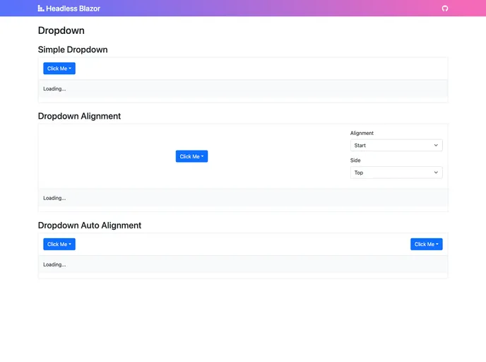
- Style-Agnostic Design: Build components without being tied to any specific design or styling framework, allowing complete design flexibility.
- Inspired by Headless UI: Leverage the best practices and design principles that made Headless UI popular, ensuring a high-quality user experience.
- Easy Integration: Effortlessly integrate with existing Blazor applications, regardless of the styling choices already made.
- Rich Components Set: Access a variety of reusable components to speed up development, helping to achieve complex UI designs without hassle.
- Robust Documentation: Benefit from comprehensive guides and examples that simplify the learning curve and help developers hit the ground running.
- Developer Experience Focused: Designed with developers in mind, offering intuitive APIs and a seamless workflow to enhance productivity.
- Customizable Elements: Tailor components to meet specific project requirements without affecting performance or usability.
- UI Kits & Components

A UI kit provides developers with a set of reusable components that can be easily integrated into a website or application. These components are pre-designed with consistent styling and functionality, allowing developers to save time and effort in the design and development process. UI kits can be either custom-built or third-party, and often include components for buttons, forms, typography, icons, and more.