React Styled Components Design Tokens
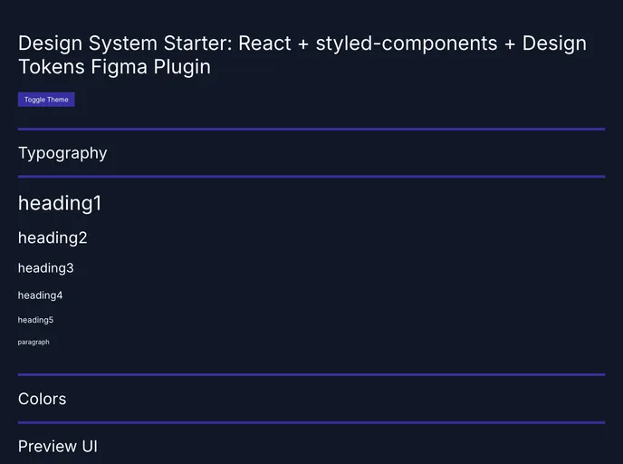
Design System Starter project with React + styled-components
Overview
React Styled Components Design Tokens serves as an excellent starting point for those looking to build a robust design system using React and styled-components. This project brings together the power of modern web technologies, allowing developers to create dynamic and visually appealing user interfaces. By focusing on design tokens, it simplifies the process of managing consistent styling across an application, ensuring a cohesive look and feel.
With its clean architecture and practical approach, this starter project is suitable for developers of all skill levels. Whether you are just starting with React or looking to enhance your existing projects, the React Styled Components Design Tokens sets a solid foundation for building scalable and maintainable design systems.
Features
- Design Tokens: Offers a framework for managing consistent design values such as colors, spacing, and typography, enhancing maintainability throughout the project.
- React Integration: Fully compatible with React, allowing you to leverage the power of components and hooks seamlessly.
- Styled-Components: Utilizes styled-components for elegant styling solutions, promoting a modular and reusable approach to CSS.
- Customizable Themes: Supports multiple themes out of the box, enabling easy customization and variation in the design system.
- Responsive Design: Built-in options for responsiveness, ensuring your application looks great on devices of all sizes.
- Documentation: Comprehensive documentation helps guide users through setup and best practices for effective usage.
- Community Support: Backed by an active community, providing ample resources and shared knowledge for troubleshooting and improvements.
- Scalability: Designed with scalability in mind, allowing your design system to grow as your application evolves.
- Figma
Figma is a cloud-based design tool for creating user interfaces, prototypes, and collaboration in real time.
- React
React is a widely used JavaScript library for building user interfaces and single-page applications. It follows a component-based architecture and uses a virtual DOM to efficiently update and render UI components
- Styled Components
Styled Components is a popular library for styling React components using CSS syntax. It allows you to write CSS in your JavaScript code, making it easier to create dynamic styles that are specific to each component.