Compound
Compound is the default component collection for Emulsify
Overview
The Emulsify Design System is a system of components called Compound. It is an open source set of components that can be used in various projects. The components can be viewed in a Storybook instance deployed on http://localhost:6006. The system is designed to facilitate development and allow for easy contribution of new components.
Features
- Open source set of components
- Works with each other
- Allows for contribution of new components
- Automatic updates when changes are made to code
- Supports dependencies for components
Summary
The Emulsify Design System, specifically the Compound component, is a versatile and open source system of components. It allows for easy development and contribution of new components. With automatic updates and support for dependencies, it aims to streamline the component development process.
- UI Kits & Components

A UI kit provides developers with a set of reusable components that can be easily integrated into a website or application. These components are pre-designed with consistent styling and functionality, allowing developers to save time and effort in the design and development process. UI kits can be either custom-built or third-party, and often include components for buttons, forms, typography, icons, and more.
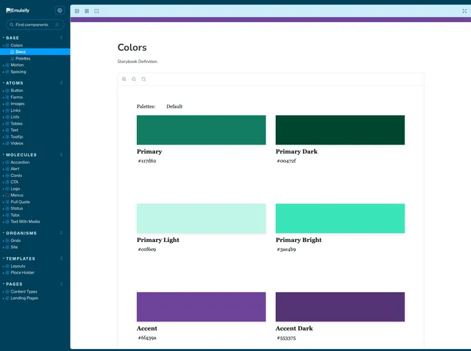
- Storybook
Storybook is a tool for developing and testing UI components in isolation. It provides a sandbox environment where you can experiment with different props and states to see how your component responds.