Ember Bootstrap
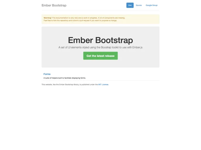
A set of UI elements styled using the Boostrap toolkit to use with Ember.js
Overview
Ember Bootstrap is a set of UI components designed specifically for use with Ember.js, styled according to the popular Twitter Bootstrap framework, version 2. It aims to streamline the process of integrating Bootstrap elements into Ember applications, allowing developers to utilize all the classic components such as modals, alerts, and forms seamlessly. Although the project is not actively maintained, it still serves as a valuable resource for those looking to implement Bootstrap elements in their Ember projects.
While the utility of the project may be limited by its lack of maintenance, it provides a solid foundation for building visually appealing and functional interfaces. Developers who are experienced with both Ember.js and Bootstrap can leverage this tool to enhance their applications, although they should take care to report bugs and participate in discussions regarding feature enhancements through the proper channels.
Features
- Rich UI Components: Includes essential UI elements like modal panes, navigation lists, alerts, and more, all styled according to Bootstrap standards.
- Dynamic Items: Items in lists can be enabled or disabled dynamically, with automatic updates to the display based on the current state.
- Multiple Form Elements: Supports various types of form fields including text fields, text areas, and dropdowns, facilitating comprehensive form handling.
- Flexible Build Options: Provides unminified and minified builds, as well as a production-ready version, ensuring ease of use across environments.
- Unit Testing Compatible: Comes with a simple setup for running unit tests to ensure the reliability of your applications.
- Community Participation: Encourages user interaction for bug reporting and feature discussions through dedicated channels, despite its current maintenance status.